A project manager responsible for the design of financial services website to market a new product or service must consider numerous factors that can influence the effectiveness of that website. Traditional methods often focus more on the art of aesthetics, rather than the science of usability. The use of conjoint analysis in website design can mean the difference between “what you see” and “what you get.”
The marketing team tasked to create the website to support a new product offering considered the typical pathway for website development. That is, to generate feedback on the current site and/or request marketing preferences; identify IT capabilities; design the site; pilot the design; gain consensus; and launch the new design.
Searching for More Objective Input
However, in this case, the company wanted more objective input for making design decisions. The team focused on a statistical technique called Design of Experiments (DOE), a testing method that allows evaluation of multiple factors simultaneously. DOE allowed the team to quantify both “main effects” (the impact of each factor acting alone) and “interactions” (the effect of factors working in combination).
In this project, a DOE technique called conjoint analysis was used to focus specifically on customer reactions to various product/service features.
The methodology of a DOE analysis is straightforward and can be systematically applied:
Phase 1: The team identifies the factors (in this case, website design elements) to test. It predetermines different “levels” of each factor to be used in the experiments.
Phase 2: Comprehensive surveys to gather customer preferences are conducted with different combinations of the factors at each level.
Phase 3: By reviewing the test results, the experimenters can interpret those factors and their combinations that are significant (in statistical terms). By eliminating the non-significant factors, the team proceeds through an iterative process of winnowing down the list to factors, or combinations of factors, with the greatest impact on positive customer reactions.
A review of how these phases unfolded for this team shows the lessons the members learned.
Phase 1: Identifying Factors for the Experiment
The team used voice of the customer (VOC) data and expert opinion to identify six features likely to have a significant impact on customer reactions to the website. In this experiment, they determined two levels for each factor. Here is a list of the factors and the two levels of each:
- Color theme: Theme A versus Theme B
- Primary graphic: Constant versus rotating (total of three images, different image every 20 seconds)
- Primary graphic size: Large versus small
- Menu orientation: Horizontal (top) versus vertical (left)
- Font: Serif versus sans-serif
- Average site load time: Less than 10 seconds versus 15 to 30 seconds
Phase 2: Running the Tests
A DOE project consists of a set of tests, each using a particular combination of all the factors at their different levels. In this case, one possible combination is:
Color Theme B + (small + constant) primary graphic + horizontal menu + serif font + 15-30-second load time
With six factors each having two levels, there are 64 possible combinations. Using all the combinations would make the experiment impractical – few customers would want to rank 64 different screen presentations.
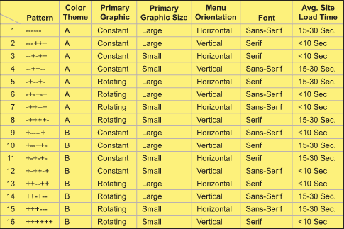
Fortunately, DOE includes methods that allow teams to select a particular subset of the possible combinations and still get valid results. This team members opted for a “quarter fraction” design, which meant they would only test 16 (= 64/4) combinations. (This is not a random subset of the 64 combinations, but a specific set defined by DOE rules.) A matrix, which can be created by any statistical software, indicates the 16 feature combinations that will be ranked by customers (Table 1).

To run the experiment, the team chose to write the combinations on index cards (which corresponded to the mock-ups that customers were shown), and have the customers order the cards by preference. The response data was therefore the ranking of each combination preferred by a particular customer. A focus group of 10 customers was used. Each customer ranked the 16 combinations and the average customer ranking and standard deviation customer ranking of the 10 customer responses was recorded.
Phase 3: Interactive Winnowing
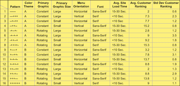
Table 2 shows a summary of the results from this ranking experiment. The first columns are the same as shown in Table 1. Two more columns have been added to show the average ranking of that combination and the standard deviation. In this example, 1 represents the highest preference, so lower numbers indicate customer preference.

The initial statistical data from the statistical software showed:
- There were three main effects (primary graphic size: large; menu orientation: horizontal; and average site load time: 15 to 30 seconds).
- There were two significant interactions (color theme: A, with menu orientation: horizontal; and color theme: A, with average site load time: 15 to 30 seconds.
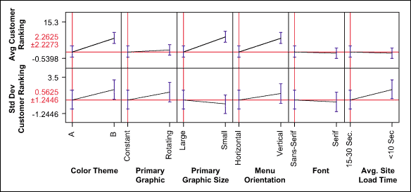
Some partial visual confirmation of the statistical output mentioned above is presented in the figure below. The figure is not a traditional main effects plot, showing the average + and average – values of each factor, however, it does show the direction and magnitude of change resulting from different factor levels. (The steepness of the line indicates the strength of the relationship.)

Since this test was done with only (16) of the (64) possible combinations, the effect of any factor, or factor combination, cannot be determined as precisely as if all the possible combinations were tested. In this example, the experiment is considered a Resolution 4, which means that some care must be taken in interpreting the results. This “confounding” effect means that some interactions will be confounded with others and there may be difficulty in distinguishing between their effects. In any case, the main effects are relatively independent of any confounding (except for three-way interactions and above) and thus the team had pretty solid confidence that it has identified them. Having an expert on the team can help members sort through the confusion and use their process knowledge to make reasonable judgment.
What Was Determined by the Team
The team determined that the three main effects and two interactions had an impact on the customer’s choice. Those factors that did not impact the customer’s perception were eliminated, while preferred factors were repeated in the next analysis. The five factors and combinations discussed above were analyzed again by the statistical software in a reduced model, and all were determined to be statistically significant with regard to customer preference.
The marketing team leveraged VOC to determine:
- Load time is not important, if a large primary graphic is used. Is this a cost savings opportunity?
- A design with a large primary graphic size and horizontal menu orientation is most preferred by customers.
- All other factors can be set at the most desirable levels based on the voice of the business.
- As long as a horizontal menu is used, the graphic size does not impact variation.