When the occasion requires it, there is often a better, faster path to Six Sigma results. Quality professionals can use the elegant theory that underlies Six Sigma statistical methods to turbo-charge projects.
The underlying, unifying concept of turbo-charged Six Sigma is called vector analysis. When columns of measurements are treated as vectors, all of the classical statistical tests in all of the classical statistical problems are consequences of the Pythagorean Theorem for right triangles, a2 + b2 = c2. Typical Six Sigma training programs teach that vector analysis tools like ANOVA (analysis of variance) and regression should be applied only to orthogonal data matrices like those used in design of experiments (DOE). But these tools also can be applied profitably to non-orthogonal observational data matrices. This is called data mining.
Data mining is a powerful, flexible process observation tool. With due regard for the possibility of correlation/causation fallacies, data mining can be used by almost anyone. It helps Six Sigma leaders harvest bottom line-enhancing information from routinely collected business and process data.
The Background: Data Mining 1919
In 1919, Ronald Fisher – whose last name gave us the F in “F ratio” – began work on a series of breakthrough projects. By 1985, with the help of computers and software, Fisher’s thinking had become the backbone in Six Sigma’s DMAIC (Define, Measure, Analyze, Improve, Control) methodology.
Fisher was asked to find out if there was a way to increase crop yields. According to his biographer Joan Fisher-Box, the first thing Fisher wanted to know was which factors affected yields and which ones didn’t. He began by graphing the actual yield measurements from 1852 to 1919. As he looked at the pattern in his analysis graph, he was immediately struckby unexpected features in the data.
Unfortunately, before Fisher could claim victory, he needed to analyze 67 years of data by hand. Imagine the labor required. Every time Fisher wanted to modify an equation, he had to recalculate all the terms in the equation. Fortunately, in one of his characteristic flashes of insight, Fisher discovered what are now known as “orthogonal polynomials.” With equations based on orthogonal polynomials, Fisher no longer had to recalculate an entire equation when one or more terms were modified.
Fisher’s data mining strategy spawned staggering breakthroughs. It led to record crop yields, more and better food choices for consumers, increased profits for the companies who served these consumers, and in the years since, many more agricultural breakthroughs.
With the advent of personal computers and statistical software, computation speed is no longer a problem. Fisher’s orthogonal polynomials are now used in computer calculations to minimize numerical instabilities. Today, his analysis techniques are available in software icon commands that can be mouse-clicked and mastered by students of all ages.
A Five-Minute PhD in Vector Analysis
Watching and recording paper helicopter flight times is a good way to familiarize yourself with Fisher’s breakthrough technique. Black Belts around the world use this helicopter simulation. It also can be an effective teaching analogy that shows people how easy it is to learn to use vector analysis. We call this the “five-minute PhD.”
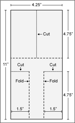
“Student pilots” record the time it takes for eight paper helicopters – modeled on a maple seed as it spins to earth from its treetop – to fly to the ground. Each helicopter is constructed differently using three factors set at two levels each. The blueprint for making the flying machines is Figure 1. Flight time is from a shoulder-height drop until it hits the floor.
Pilots then view their measurements with the frame of a data matrix. In a matter of minutes, statistically accurate answers emerge. (Please validate this claim for yourself. Build all eight copters using sturdy paper. Fly them and time them.)
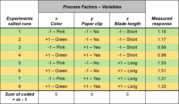
The first flight time, 1.15 seconds, in Figure 2 came from a pink copter with no paper clip weight and a short blade. The next flights follow suit. (A long blade is the full 4.75 inches as detailed in the blueprint. A short-blade version uses the same blueprint, but the length of the blade is trimmed to 3 inches.)
As you look at Figure 2, which of the three helicopter factors do you think probably lead to the longest flight times?
- X – the color of paper used to construct the helicopter
- Y – the weight of the paper clip attached to the copter
- Z – the length of the helicopter’s blades
If you answered, “Helicopters with long blades and no paper clip weight have longer flight times,” you are correct. Not only that, you are correct at the 95 percent confidence level. A few mouse clicks of any data matrix software program provide the required confirmation of the intuitive vector analysis.
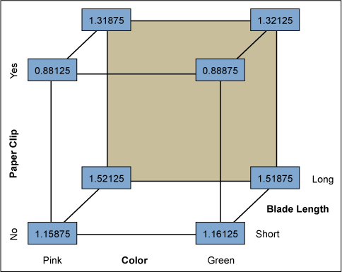
Your success is no accident. Fisher imagined Six Sigma projects 80 years ago and taught people how to use what we now know as Six Sigma statistical tools in a way almost anyone can master. The corners of a cube help people see breakthrough factor combinations, as seen in Figure 3. Fisher’s geometric vector analysis insight, the Six Sigma turbo-charger, was more than a designed experiment. It is a remarkable way to look at the world. Easily recognized patterns are only one of many attractive features in Fisher’s analysis process.
How Turbo-charged Six Sigma Theory Works
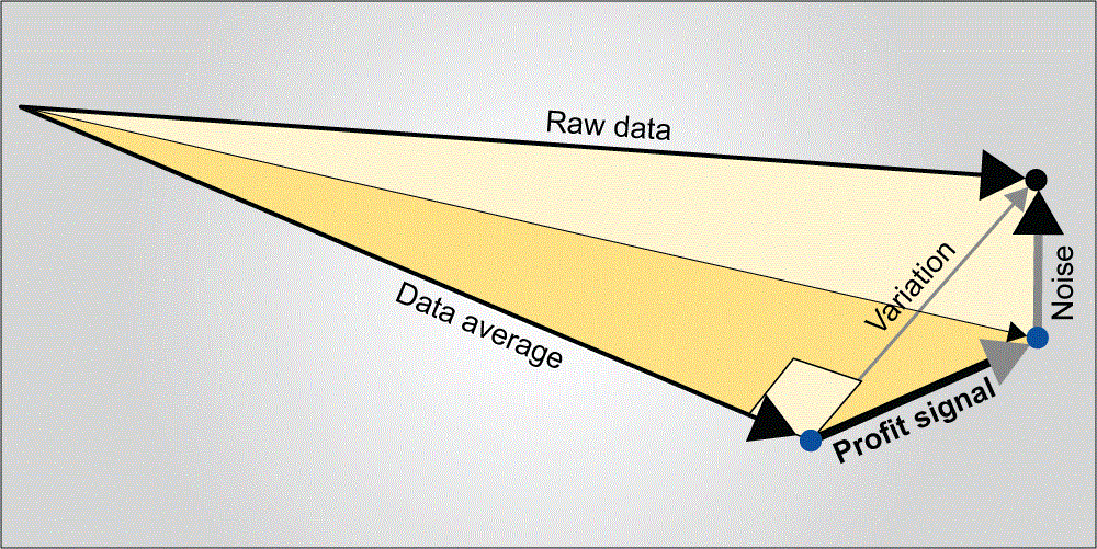
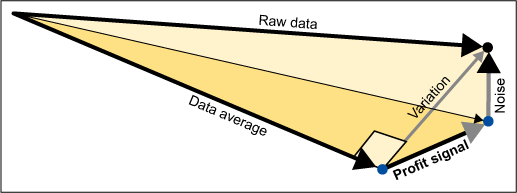
Every measurement means more when it is framed by its data vector. In a data matrix array like Figure 2, the right hand column of numbers is best treated as a single entity rather than eight numbers, each in its own cell. This entity is called a vector; a vector defines magnitude and direction. Vector analysis is much easier to understand when it is presented as a picture, a physical model or preferably both (Figure 4).
In the helicopter example, the eight flight times become the raw data vector. The average flight time becomes a second vector. The variation vector – the differences between the raw data and the data average – is the third vector in an analysis. The sample standard deviation, familiar to many from their Statistics 101 class or Black Belt training, is basically the length of the variations vector. The variations vector is then broken down into “profit signal” and “noise” vectors. The profit signal and noise vectors are orthogonal to each other, so the variation vector is the hypotenuse in a right triangle.
When you looked at the data in Figure 2, you immediately saw what Fisher envisioned in his mind’s eye. The four longest flight times paralleled the last four flights. The last four flights all had long blades. Intuitively, you reasoned that long blades were related to long flights. Your reasoning was correct.
You then noticed that the four shortest times all had a paper clip attached. You reasoned that paper clips probably did affect these flight times. You were right again.
Finally, since you could see no pattern emerging from the copter’s color, that factor probably didn’t make much of a difference. You made three good analytic judgment calls in a row without calculating a single equation.
Cross check your five-minute PhD judgments with any data matrix software statistical output. You will discover that the P values for blade length and paper clip are 0.02 and 0.04 respectively. Using Fisher’s 1919 strategy, your calculations were manageable and neat. They also were correct at the 95 percent confidence level.
The Excel worksheet in Figure 5 was created in June 2003 by Dr. Russell Boyles. It pulls the curtain back from vector analysis mystery. Fisher’s turbo-charger and the arcane mysteries of vector analysis become transparent.
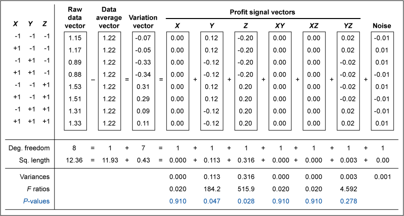
Statistical software applications, and this Excel worksheet, simply square each flight time. These squared values are then summed to arrive at the squared length or “sum of squares” for each vector: raw data, data average, variation and profit signal for each factor. (Taking the square root of a squared length gives an actual vector length. Actual vector lengths let you build a physical vector analysis model.)
Notice that the squared lengths for two longest vectors were key factors Z (blade length) and Y (paper clip weight) – or 0.36 and 0.113 respectively. An Excel formula in the spreadsheet automatically creates the F ratio by comparing the length of the profit signal vector to the length of the noise vector. The factors blade length and paper clip weight had statistically significant effects. As illustrated in Figure 5, the profit signal vectors for these factors were “long and strong,” while the noise vector was “short and weak.”
An Example: Turbo-charged Data Mining a Century Later
The team at XYZ Company has three years of spreadsheet data on advertising campaign yields. Although the accounting, finance, sales and marketing divisions had no Black Belts, they did have Six Sigma-sized questions. They wanted to understand the components of variation in their system. They wanted to know which factors made the biggest difference and which ones didn’t. They wanted answers fast. They wanted dollars to hit the bottom line.
A turbo-charged Six Sigma Black Belt from the production department overheard their discussion and prescribed some on-the-fly data mining based on vector analysis. They accepted her offer to demonstrate.
In a few minutes, the Black Belt arrayed the top three of their 35 potential factors using Sir Ronald Fisher’s vintage strategy:
- Is Joe or Sally the better salesperson?
- Did the offer of an incentive impact sales or not?
- Should money be spent on radio or newspaper advertising?
Using Excel’s Data, Filter, AutoFilter feature, they queried their data base eight times. As shown in Figure 6, each query was a unique combination of the three factors under consideration.
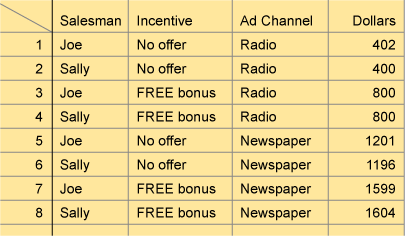
The first query result, 402 (thousand dollars), was the average of past dollar production when Joe was the salesperson, no incentive was offered and radio was the ad channel. The next seven runs follow suit with the largest number of dollars, $1,604,000 being produced when incentives and the newspaper were used.
After some discussion, the group agreed that who the salesperson was didn’t seem to make much of a difference. The newspaper ad channel seemed to be very important, particularly when it was paired with a free bonus sales incentive. The Black Belt clicked her Excel vector analysis spreadsheet. Her software analysis cube and statistical output confirmed that the newspaper’s P-value was 0.001 and the sales incentive’s P-value was 0.003. She expressed a high degree of confidence in their insight.
Total project time was about 30 minutes. After the spectacular results, the group asked when the next Six Sigma training course was offered. They wanted to be able to make faster, better and more profitable judgments like this in the future.
Acknowledgments: My colleague Dr. Russell Boyles, co-author of Profit Signals-How Evidence-Based Decisions Power Six Sigma Breakthroughs and a founding partner of Evidence-Based Decisions, Inc., contributed several passages in this article, edited preliminary drafts and provided precise statistical terminology where needed. The “maple seed” teaching analogy used in this article was created by C. B. “Kip” Rogers while he worked at Digital Equipment in Marlboro, Mass. I was introduced to it by Dr. George Box at the University of Wisconsin in 1995.in a few minutes