Six Sigma practitioners are aware of the range of numeric data types, from attribute data counts and tallies to continuous data measures on a scale. As the information strength in an element of data depends on the number of potential values it might take on, attribute yes/no data has to be considered the weakest. Many times in software and technology, attribute data is what is available. Thus, it is valuable to look closely at the nature of attribute data and explore some tips for making the most of it.
While some might prefer always dealing with continuous data in projects, the fact is that attribute is the most useful form of data in some situations – such as when issues or problems occur as discrete events, apparently measurable only in terms of count or proportion data. Either an event happens or it does not; or maybe it is a Type 1 or Type 2 or whatever category. Or maybe a team can calculate a proportion, like the count of servers that have startup failures divided by the total number of startups in a given time frame. These are all very useful forms of data and attribute as they may be, over time and in sufficient quantity they can be very effective at helping to identify patterns, signals and ultimately root causes to solve problems. (p-charts, c-charts, contingency tables, proportion tests and sub-grouping techniques can all be effective analysis tools for attribute data.)
Persistent Nemesis Is Sample Size
The persistent nemesis for any user of attribute data is sample size. That is, a large number of samples are required to confidently make decisions using attribute data. For example, this year the Yankees and the Red Sox both played 162 baseball games. The Yankees won 97 times, the Red Sox 86. That is a difference of 11 wins, and it sounds like a lot, but keep in mind that even if the teams were exactly equal in ability there is a good chance that their records could be different (two equally fair coins flipped 162 times will often yield a different number of heads). So, one can ask the probabilistic question, “Is the difference between the Yankees’ and Red Sox’ records any better than might have been obtained by chance?” The results of a Minitab analysis for this question are shown in Figure 1.

Based on the statistics, there is a 21.7 percent chance (p-value) of being in error if it is assumed that the teams are different. And, given the two teams’ winning percentages, to assure a decision with at most a 5 percent chance of being wrong to assume there is a difference (while at the same time ensuring that the risk of being wrong to assume they are equal is no more than 10 percent), each team would have to play at least 1,119 games! Clearly that many games would be unbearable to the players (and the fans), just like collecting huge samples is impossible for many projects.
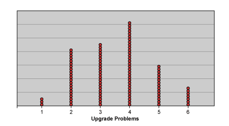
So in the absence of an ability to collect large amounts of data, how can attribute data be handled? To start with, project teams need to begin to think about data in terms of events, not numbers or percentages, but unique situations that have singular characteristics which can be categorized meaningfully. Of course, this requires research and discipline, but after all that is a lot of what Six Sigma is all about. And with small sample sizes, it should not be too painful. For example, imagine that a department runs software upgrades every now and then. Every time it upgrades the software, somebody reports a problem, so it is decided to measure the count of problems per upgrade. For the last 100 upgrades, very few problems per upgrade are experienced, with a distribution that ranges from a minimum of one problem to a maximum of six problems. Figure 2 below shows this distribution:

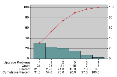
A glance at this distribution shows any team that it has discrete, granular data, meaning that there is apparently a small number of possible values. Fortunately, there are not many problems per upgrade. Since there are six discrete categories of counts – 1, 2, 3, 4, 5,or 6 – a team can treat this as it would survey data using a likert scale to determine the probability of any given number of problems in an upgrade (Figure 3). This is useful baseline data which can help assess the current state, but there is little information for the exploration of root causes.

Putting the Data into Categories
Enter the notion of parsing the data into categories. By studying the events and understanding their unique circumstances, a team should be able to develop meaningful categories for grouping. Depending on how it is done, categorizing (and rationally sub-grouping) data has the potential to provide multiple insights including:
- The ability to see the relative contribution of problem categories.
- The ability to observe a more continuous (less granular) distribution of counts.
Since the value of collecting defect data with categorical information is often addressed in this and other forums, that topic can be skipped in favor of showing the potential of sub-grouping the data in a logical way to reveal a less granular distribution. Back to the example, imagine that the upgrades occur at fairly regular intervals in groups of approximately five. If the team takes the 100 releases, creates 20 consecutive groups of five, and sums the problems within the groups, it will see a distribution like Figure 4.

The first observation to make here is the difference between this chart and Figure 2. This is the same data with a different method of grouping and consequently a different distribution. Note especially how the data points (groups) are more dispersed, since there is now a much large range (and number) of possible values. Now the data cover a range of 13 to 25. This dispersion has the effect of reducing the relative impact of the granularity because a unit change of one across a range of 12 has much less impact than a unit change of one across a range of 5. Because the data in Figure 4 are less granular, one can begin to discern patterns in the data which will then prompt questions that lead to understanding the nature of the system’s behavior. For example, the results of Figure 4 might prompt the questions, “What do the two groups that each has 25 problems have in common? Is there something going on there or is it just random?” Bear in mind that how the data is grouped will be critical in determining what issues (if any) get exposed. Data can be grouped by time, type of event, complexity, number of failure points, location, or just about anything else that may be a factor. Most importantly, a team should try to look at data in many different ways and avoid creating groups that are dramatically unequal in volume (in this case number of upgrades) or any other known variation source that can skew the results. In other words, an effort should be made to select groups to reveal sources of variation that can be controlled (factors) and randomize the variation that cannot be controlled (noise).
Using Attribute Data in Form of a Ratio
Another useful way torture attribute data into revealing information is to consider using data in the form of a ratio. There is a general principle that is very useful when considering the analysis of ratios:
If both the numerator and denominator in a ratio are attribute, then you must treat the quotient as attribute data; but if either is continuous, then the resulting ratio may be treated as continuous data.
In the information technology (IT) environment, practitioners are typically limited to one source of continuous data – time. (There are others – such as money – but time is the most common continuous metric.) Time to complete a project, time to fix a problem, time to process a transaction – these are all common continuous variables. Often defects are reported as defects per some amount of time: problems per day, problems per week, problems per month, etc.
In the upgrade example, assume that upgrades (for various software components) are occurring continuously. Last month the number of problems reported was 25, so the rate was 25 problems per month. Inverting this ratio shows 1 month per 25 problems or 0.04 months per problem. (This also could be expressed as 1.2 days per problem for a 30-day month.) This is the average interval between reported problems – time between failures – a very nice continuous variable. Since averages will always hide the inherent variation and impede problem-solving efforts, the next step is to look for records of when each problem was reported and then analyze the individual intervals between problems to look for patterns. This is typically easy to do since most problem-tracking systems record when the problems are reported.
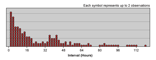
Using this approach for all the upgrade problems reported in a year, a team would be able to plot the continuous distribution of intervals between problems as shown in Figure 5. (These are the intervals between problems for a given upgrade. The interval calculation for the first problem of each upgrade is the difference between when the upgrade was released and when the first problem was reported.)

Getting the Data to Reveal Patterns
Note that the distribution of the data shows most of the time the interval between problems is less than 14 hours (median is 14). Keeping in mind that longer intervals between failure are more desirable, this distribution shows that there is much opportunity to be exploited. In particular, the distribution reflects the fact that problems with upgrades tend to appear quickly, and in high concentrations immediately following the upgrades (think of “infant mortality” for hardware). This view of the data provides very rich information which should prompt questions such as: “Why do so many problems occur so quickly? Are they due to testing or requirements failures or something else? What’s up with the strange concentration of problems in the 32 to 48 hour time frame? Are problems reported after 48 hours due to different problems than the earlier problems?”
In addition to prompting questions this picture can reveal where improvement efforts should be concentrated. If a team can cut in half the number of problems occurring in less than 16 hours, it will make a significant dent in the overall number of problems reported.
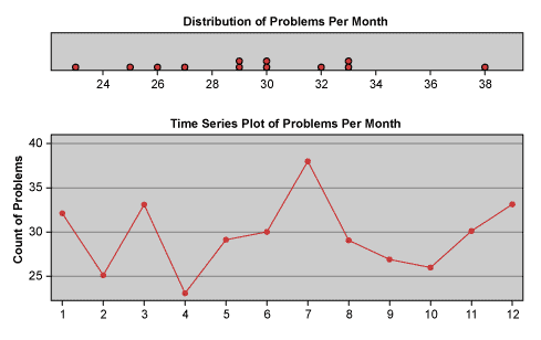
In Figure 6, a team may recognize the ways in which a metric such as problems per month is typically charted (in this case, it is both a frequency chart and a run chart).

Recalling that problems per month is no more than the inverse of months per problem, which is the average interval between problems for a given month, a team can easily observe how the charting of averages hides the richness of detail that is so useful for identifying patterns and ultimately solving problems. The beauty in this is that Figure 5 is basically the same data simply expressed in a different way, and it does not require much additional effort to turn what is typically accepted as count data into continuous, time-based data.
The ability to utilize data to reveal patterns is critical to a team’s ability to solve problems. The reality is that most situations in an IT environment are measured by counts of events. On the surface, one might be inclined to accept this as a handicap in analyzing data, especially if large sample sizes are not available. However, a few intuitive changes to the data, whether by categorizing and sub-grouping the counts or by turning counts into time intervals between events, can reveal rich possibilities for analysis. And if nothing else, thinking about data in different ways will ultimately empower a team to create a more complete understanding of the system it endeavors to change.