
Most processes, particularly those involving life data and reliability, are not normally distributed. Most Six Sigma and process capability tools, however, assume normality. Only through verifying data normality and selecting the appropriate data analysis method will the results be accurate. This article discusses the non-normality issue and helps the reader understand some options for analyzing non-normal data.
Introduction
Some years ago, some statisticians held the belief that when processes were not normally distributed, there was something “wrong” with the process, or even that the process was “out of control.” In their view, the purpose of the control chart was to determine when processes were non-normal so they could be “corrected,” and returned to normality. Most statisticians and quality practitioners today would recognize that there is nothing inherently normal (pun intended) about the normal distribution, and its use in statistics is only due to its simplicity. It is well defined, so it is convenient to assume normality when errors associated with that assumption would be minor. In fact, most of the efforts done in the interest of quality improvement lead to non-normal processes, since they try to narrow the distribution using process stops. Similarly, nature itself can impose stops to a process, such as a service process whose waiting time is physically bounded at the lower end by zero. The design of a waiting process would move the process as close to zero as economically possible, causing the process mode, median and average to move toward zero. This process would tend towards non-normality, regardless of whether it is stable or non-stable.
Many processes do not follow the normal distributions. Some examples of non-normal distributions include:
- Cycle time
- Calls per hour
- Customer waiting time
- Straightness
- Perpendicularity
- Shrinkage
To help you understand the concept, let us consider a data set of cycle time of a process (Table 1). The lower limit of the process is zero and the upper limit is 30 days. Using the Table 1 data, the process capability can be calculated. The results are displayed in Figure 1.
| Table 1: Cycle Time Date | |||||||||
| 19 | 11 | 30 | 24 | 24 | 20 | 28 | 27 | 26 | 20 |
| 17 | 53 | 32 | 33 | 39 | 26 | 20 | 48 | 21 | 34 |
| 36 | 43 | 42 | 43 | 41 | 40 | 35 | 24 | 21 | 23 |
| 22 | 20 | 25 | 39 | 26 | 53 | 19 | 13 | 27 | 28 |
| 35 | 11 | 42 | 38 | 32 | 27 | 24 | 22 | 18 | 17 |
| 17 | 15 | 15 | 9 | 51 | 26 | 25 | 13 | 47 | 37 |
| 52 | 17 | 4 | 8 | 9 | 18 | 16 | 5 | 49 | 11 |
| 8 | 31 | 14 | 31 | 24 | 19 | 41 | 2 | 25 | 1 |
| 8 | 7 | 16 | 34 | 21 | 9 | 14 | 31 | 16 | 14 |
| 5 | 2 | 10 | 42 | 21 | 15 | 21 | 11 | 15 | 22 |
| 9 | 32 | 56 | 48 | 27 | 24 | 21 | 24 | 31 | 33 |
| 31 | 15 | 40 | 27 | 24 | 22 | 14 | 13 | 13 | 14 |
| 14 | 43 | 37 | 18 | 17 | 47 | 10 | 13 | 14 | 22 |
| 8 | 54 | 8 | 25 | 8 | 19 | 18 | 9 | 3 | 32 |
| 21 | 16 | 6 | 36 | 36 | 9 | 21 | 7 | 28 | 28 |
| 20 | 17 | 25 | 15 | 21 | 10 | 11 | 6 | 4 | 8 |
| 21 | 23 | 22 | 5 | 5 | 21 | 15 | 13 | 14 | 6 |
| 12 | 34 | 15 | 14 | 7 | 6 | 9 | 14 | 23 | 18 |
| 7 | 10 | 14 | 26 | 12 | 28 | 30 | 26 | 34 | 14 |
| 25 | 17 | 13 | 18 | 19 | 21 | 27 | 27 | 23 | 13 |
| 12 | 2 | 2 | 24 | 35 | 12 | 28 | |||

If you observe the normal distribution curve for both the within and overall performance, you would see that the curve extends beyond zero and calculates the long term PPM less than zero as 36465.67.
Is this applicable in this process where the process is bounded by zero? Use of the normal distribution for calculating the process capability actually penalizes this process because it assumes data points outside of the lower specification limit (below zero) when it is not possible for that to occur.
The first step in data analysis should be to verify that the process is normal. If the process is determined to be non-normal, various other analysis methods must be employed to handle and understand the non-normal data.
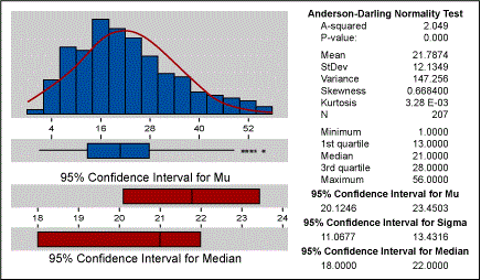
For the above data, if we calculate the basic statistics they would indicate whether the data is normal or not. Figure 2 below indicates that the data is not normal. The p-value of zero and the histogram help in confirming that the data is not normal. Also, the fact that the process is bounded by zero is an important point to consider.
The most common methods for handling non-normal data are:
- Subgroup averaging
- Segmenting data
- Transforming data
- Using different distributions
- Non-parametric statistics
Subgroup Averaging
- Averaging the subgroups (recommended size greater than 4) usually produces a normal distribution
- This is often done with control charts
- Works on the central limit theorem
- The more skewed the data, the more samples are needed
Segmenting Data
- Data sets can often be segmented into smaller groups by stratification of data
- These groups can then be examined for normality
- Once segmented, non-normal data sets often become groups of normal data sets
Transforming Data
- Box-Cox transformations of data
- Logit transformation for Yes or No data
- Truncating distributions for hard limits (like the data set presented here)
- Application of meaningful transformations
- Transformations do not always work
Using Different Distributions
- Wiebull distributions
- Log normal
- Exponential
- Extreme value
- Logistic
- Log logistic
Non-parametric Statistics
- Used for statistical tests when data is not normal
- Tests using medians rather than means
- Most often used when sample sizes of groups being compared are less than 100, but just as valid for larger sample sizes
For larger sample sizes, the central limit theorem often allows you to use regular comparison tests.
When performing statistical tests on data, it is important to realize that many statistical tests assume normality. If you have non-normal data, there are parametric equivalent statistical tests that should be employed. Table 2 below summarizes the statistical tests to use with normal process data as well as the and non-parametric statistical test equivalents.
| Table 2: Common Statistical Tests for Normal and Non Parametric Data | |
| Assumes Normality | No Assumption Required |
| One sample Z test | One sample sign |
| One sample t-test | One sample Wilcoxon |
| Two sample t-test | Mann-Whitney |
| One way ANOVA (analysis of variance) | Kruskal-Wallis Moods Median |
| Randomized block (two-way ANOVA) | Friedman test |
If we look back at our Table 1 data set where zero was the hard limit, we can illustrate what tests might be employed when dealing with non-normal data.
Setting a Hard Limit
If we set a hard limit at zero and re-run the process capability, the results are presented in Figure 3.
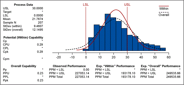
Figure 3 now indicates that the long term PPM is 249535.66, as opposed to 286011.34 in Figure 1. This illustrates that quantification can be more accurate by first understanding whether the distribution is normal or non-normal.
Weibull Distribution
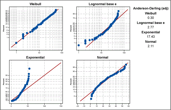
If we take this analysis a step further, we can determine which non-normal distribution is a best fit. Figure 4 displays various distributions overlaid on the data. We can see that the Weibull distribution is the best fit for the data.
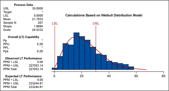
Knowing that the Weibull distribution is a good fit for the data, we can then recalculate the process capability. Figure 5 shows that a Wiebull model with the lower bound at zero would produce a PPM of 233244.81. This estimate is far more accurate than the earlier estimate of the bounded normal distribution.
Box-Cox Transformation
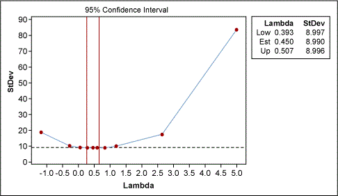
The other method that we discussed earlier was transformation of data. The Box-Cox transformation can be used for converting the data to a normal distribution, which then allows the process capability to be easily determined. Figure 6 indicates that a lambda of 0.5 is most appropriate. This lambda is equivalent to the square root of the data.
After using this data transformation, the process capability is presented in Figure 7. This transformation of data estimates the PPM to be 227113.29, which is very close to the estimate provided by the Weibull modeling.
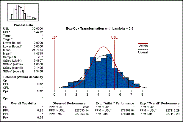
We have seen three different methods for estimating the appropriate process capability of the process in case the data is from a non-normal source: setting a hard limit on a normal distribution, using a Weibull distribution and using the Box-Cox transformation.
Subgroup Averaging
Now let us assume that the data is collected in time sequence with a subgroup of one. The X bar R chart with subgroups cannot be used. Had the data been collected in subgroups the Central limit theorem would come in handy and the data would have exhibited normality. If we use the individual moving range chart – which is the more appropriate chart to use – Table 3 displays the results.
| Table 3: I/MR for Cycle Time |
| Test Results for I Chart TEST 1. One point more than 3.00 sigmas from center line. Test Failed at points: 12 36 55 61 103 132 TEST 2. 9 points in a row on same side of center line. TEST 3. 6 points in a row all increasing or all decreasing. TEST 5. 2 out of 3 points more than 2 sigmas from center line (on one side of CL). TEST 6. 4 out of 5 points more than 1 sigma from center line (on one side of CL). TEST 8. 8 points in a row more than 1 sigma from center line (above and below CL). Test Results for MR Chart TEST 2. 9 points in a row on same side of center line. |
Figure 8 indicates that the process is plagued by special causes. If we focus only on those points that are beyond the three sigma limits on the I chart, we find the following data points as special causes.
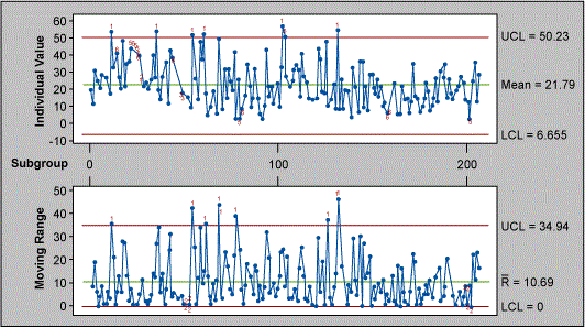
TEST 1. One point more than 3.00 sigmas from centerline.
Test Failed at points: 12 36 55 61 103 132.
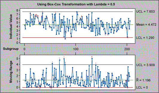
The primary assumption in the Figure 8 control chart is that the data is normal. If we plot the I-MR chart applying the Box-Cox transformation as above, the looks much different (see Figure 9).
| Table 4: I/MR for Cycle Time |
| Test Results for I Chart TEST 1. One point more than 3.00 sigmas from center line. Test Failed at points: 80 TEST 2. 9 points in a row on same side of center line. TEST 3. 6 points in a row all increasing or all decreasing. TEST 5. 2 out of 3 points more than 2 sigmas from center line (on one side of CL). TEST 6. 4 out of 5 points more than 1 sigma from center line (on one side of CL). TEST 8. 8 points in a row more than 1 sigma from center line (above and below CL). Test Results for MR Chart TEST 2. 9 points in a row on same side of center line. |
If we attempt to study the number of points outside the three sigma limits on the I chart, we note that the test fails at only one point – number 80 – and not at points 12 36 55 61 103 132 as indicated by the Figure 8 chart earlier. In fact, if you study the results of other failure points one would realize the serious consequences of assuming normality: doing so might cause you to react to common causes as special causes, which would lead to tampering of the process. It is important to note that for X bar R chart the problem with normality is not serious due to the central limit theorem, but in the case of Individual Moving Range chart there could be serious consequences.
Now let’s consider a case where we would like to study whether the mean cycle time of this process is at 20 days. If we assume data normality and run a one sample t test to confirm this hypothesis, Table 5 displays the results.
| Table 5: One-Sample T – Cycle Time |
| Test of mu = 20 vs mu not = 20 Variable N Mean StDev SE Mean turn around 207 21.787 12.135 0.843 Variable 95.0% CI T P turn around (20.125, 23.450) 2.12 0.035 |
Based on the above statistics, one would pronounce at an alpha risk of 5 percent that the mean of the data set is different than 20. If we were to verify the fact that the data is not normal, we would have run the one sample Wilcoxon test which is based on the medians rather than the means, and we would have obtained the results found in Table 6.
| Table 6: Wilcoxon Signed Rank Test: Cycle Time |
| Test of median = 20.00 versus median not = 20.00 N for Wilcoxon Estimated N Test Statistic P Median turn around 207 202 11163.5 0.273 21.00 |
The Wilcoxon test indicates that the null hypothesis (test median is equal to 20) is accepted, and there is no statistical evidence that the median is different than 20.
The above example illustrates the fact that assuming that the data is normal and applying statistical tests is dangerous. As a better strategy in data analysis, it is better to verify the normality assumption and then – based on the results – use an appropriate data analysis method.