It is a common scenario: A practitioner has sales data for the past several months and wants to forecast next month’s sales volume. This type of forecasting can help manufacturers and distributors ensure they have enough product to meet customer demands. But how is this forecasting done? Statistical analysis software offers two ways to plot the data in order to make a forecast: 1) a linear trend model or 2) a quadratic trend model. It is important for practitioners to understand both methods, as each can be beneficial, depending on the type of process being analyzed.
Part 1 – Linear Trend
The following explanations use the sample data shown in Table 1.
Table 1: Sample Volume Data
| Month | Volume |
| Jan. 2009 | 98 |
| Feb. 2009 | 105 |
| March 2009 | 116 |
| April 2009 | 119 |
| May 2009 | 135 |
| June 2009 | 156 |
| July 2009 | 177 |
| Aug. 2009 | 208 |
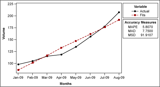
To begin, use statistical analysis software to create a time series plot with a linear trend analysis (Figure 1).

The software will generate a fitted line using the equation Yt = 71.43 + (15.1 x t). The t represents the time period during which each data point was collected – i.e., the first time period is 1, the second is 2 and so on. Hence, if someone wants to know the fitted value for January 2009, it is 71.43 +15.1*(1) = 86.53.
Table 2: Fitted Values for Past Months
| Month | Volume | Fitted Value | t |
| Jan. 2009 | 98 | 86.53 | 1 |
| Feb. 2009 | 105 | 101.63 | 2 |
| March 2009 | 116 | 116.73 | 3 |
| April 2009 | 119 | 131.83 | 4 |
| May 2009 | 135 | 146.93 | 5 |
| June 2009 | 156 | 162.03 | 6 |
| July 2009 | 177 | 177.13 | 7 |
| Aug. 2009 | 208 | 192.23 | 8 |
To forecast for September 2009, the practitioner would get 207.33 (71.43 + (15.1 x 9)).
But how does the software get the equation Yt = 71.43 + (15.1 x t)? It is nothing but linear regression. If practitioners used the linear regression function in their statistical analysis software instead, using volume for Y and the t (1, 2, 3, 4, etc.) for X they would get the same equation:
Regression Analysis: Volume versus t
The regression equation is
Volume = 71.4 + 15.1 t
Predictor Coef SE Coef T P
Constant 71.429 8.626 8.28 0.000
t 15.071 1.708 8.82 0.000
S = 11.0701 R-Sq = 92.8% R-Sq(adj) = 91.7%
Analysis of Variance
Source DF SS MS F P
Regression 1 9540.2 9540.2 77.85 0.000
Residual Error 6 735.3 122.5
Total 7 10275.5
Another potentially confusing element of the linear trend plot is the forecast accuracy measures: MAD, MAPE and MSD. These are used to determine how well the trend will accurately predict the future volume.
MAD
MAD stands for mean absolute deviation, which is the average of the absolute deviations. An absolute deviation is the absolute value of the actual data minus the fitted value (Table 3).
Table 3: Sample Data Including Absolute Deviation
| Month | Volume | Fitted Value | t | Absolute Deviation |
| Jan. 2009 | 98 | 86.53 | 1 | 11.47 |
| Feb. 2009 | 105 | 101.63 | 2 | 3.37 |
| March 2009 | 116 | 116.73 | 3 | 0.73 |
| April 2009 | 119 | 131.83 | 4 | 12.83 |
| May 2009 | 135 | 146.93 | 5 | 11.93 |
| June 2009 | 156 | 162.03 | 6 | 6.03 |
| July 2009 | 177 | 177.13 | 7 | 0.13 |
| Aug. 2009 | 208 | 192.23 | 8 | 15.77 |
| Sum | 62.26 | |||
| n | 8 | |||
| MAD | 7.7825 |
The best fitted line should have zero MAD; the larger the MAD, the worse the model. For instance, instead of using linear regression to generate a forecast, a practitioner might base the forecast on last month’s volume. This generates a different MAD value (Table 4).
Table 4: Forecast Using Last Month’s Volume
| Month | Volume | Fitted Value | t | Absolute Deviation |
| Jan. 2009 | 98 | 80 | 1 | 18 |
| Feb. 2009 | 105 | 98 | 2 | 7 |
| March 2009 | 116 | 105 | 3 | 11 |
| April 2009 | 119 | 116 | 4 | 3 |
| May 2009 | 135 | 119 | 5 | 16 |
| June 2009 | 156 | 135 | 6 | 21 |
| July 2009 | 177 | 156 | 7 | 21 |
| Aug. 2009 | 208 | 177 | 8 | 31 |
| Sum | 128 | |||
| n | 8 | |||
| MAD | 16 |
The MAD value allows the practitioner to conclude that the model generated by linear regression is better than the model generated by last month’s volume.
MSD
The linear trend plot also uses the accuracy measure MSD, which stands for mean square deviation. It is very similar to MAD, but instead of summing the absolute deviations, this measure sums up the squared deviations (Table 5).
Table 5: Sample Data Including Squared Deviations
| Month | Volume | Fitted Value | t | Absolute Deviation | Squared Deviations |
| Jan. 2009 | 98 | 86.5 | 1 | 11.47 | 132.25 |
| Feb. 2009 | 105 | 101.571429 | 2 | 3.37 | 11.75510204 |
| March 2009 | 116 | 116.642857 | 3 | 0.73 | 0.413265306 |
| April 2009 | 119 | 131.714286 | 4 | 12.83 | 161.6530612 |
| May 2009 | 135 | 146.785714 | 5 | 11.93 | 138.9030612 |
| June 2009 | 156 | 161.857143 | 6 | 6.03 | 34.30612245 |
| July 2009 | 177 | 176.928571 | 7 | 0.13 | 0.005102041 |
| Aug. 2009 | 208 | 192 | 8 | 15.77 | 256 |
| Sum | 735.2857143 | ||||
| n | 8 | ||||
| MSD | 91.91071429 |
So what is the difference? MSD weights large deviations more heavily because it takes the square of the deviations. In general, MSD is preferred over MAD because there seems to be more theoretical support for it.
MAPE
The third accuracy measure is MAPE, or mean absolute percentage error. It is calculated by taking the absolute deviation and dividing it by the data (the volume in this case) to get the percent error (Table 6).
Table 6: Sample Data Including Absolute Percent Error
| Month | Volume | Fitted Value | t | Absolute Deviation | Absolute Percent Error |
| Jan. 2009 | 98 | 86.5 | 1 | 11.5 | 11.73469388 |
| Feb. 2009 | 105 | 101.571429 | 2 | 3.428571429 | 3.265306122 |
| March 2009 | 116 | 116.642857 | 3 | 0.642857143 | 0.554187192 |
| April 2009 | 119 | 131.714286 | 4 | 12.71428571 | 10.68427371 |
| May 2009 | 135 | 146.785714 | 5 | 11.78571429 | 8.73015873 |
| June 2009 | 156 | 161.857143 | 6 | 5.8571428571 | 3.754578755 |
| July 2009 | 177 | 176.928571 | 7 | 0.071428571 | 0.040355125 |
| Aug. 2009 | 208 | 192 | 8 | 16 | 7.692307692 |
| Sum | 46.4558612 | ||||
| n | 8 | ||||
| MAPE | 5.80698265 |
MAPE is typically used less often than MAD and MSE.
Part 2 – Quadratic Trend
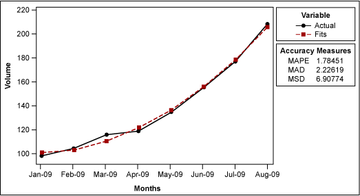
If the practitioner suspects the trend in volume is quadratic rather than linear (meaning the volume is increasing at a faster rate than it would with linear proportion), they would create a plot with a quadratic trend in their statistical analysis software (Figure 2).

It is no surprise that this model is better than the linear model from a MAPE, MAD and MSD perspective because it is a more complex model, requiring more terms. However, it is generally impossible to say which is the correct model to use. The decision requires a judgment call based on the practitioner’s understanding of the process.
The equation used with the quadratic trend is Yt = 101.61 – (3.04 x t) + (2.012 x t2), Once again, this equation is reached through regression analysis. To complete this regression using statistical analysis software, the practitioner first needs to square the t series (Table 7).
Table 7: Sample Data with T Value Squared
| Month | Volume | t | t2 |
| Jan. 2009 | 98 | 1 | 1 |
| Feb. 2009 | 105 | 2 | 4 |
| March 2009 | 116 | 3 | 9 |
| April 2009 | 119 | 4 | 16 |
| May 2009 | 135 | 5 | 25 |
| June 2009 | 156 | 6 | 36 |
| July 2009 | 177 | 7 | 49 |
| Aug. 2009 | 208 | 8 | 64 |
Next, the practitioner performs a multiple regression of the volume on t and t2. The result is:
Regression Analysis: Volume versus t, t sqr
The regression equation is
Volume = 102 – 3.04 t + 2.01 t sqr
Predictor Coef SE Coef T P
Constant 101.607 4.638 21.91 0.000
t -3.036 2.365 -1.28 0.256
t sqr 2.0119 0.2565 7.84 0.001
S = 3.32451 R-Sq = 99.5% R-Sq(adj) = 99.2%
Analysis of Variance
Source DF SS MS F P
Regression 2 10220.2 5110.1 462.35 0.000
Residual Error 5 55.3 11.1
Total 7 10275.5
Source DF Seq SS
t 1 9540.2
t sqr 1 680.0
The equation is the same as the one generated when creating the quadratic trend analysis plot.