TaaG (trends at a glance) analysis is a fast way to compare trends of subsets of data across large data sets. It is an ideal tool to use in the Measure and Control phases of DMAIC (Define, Measure, Analyze, Improve, Control) projects.
The value of TaaG analysis is best understood by way of example. Suppose you had the following data that includes three distinct groups tracking the number of negative incidents each group worked on, each month, over a rolling 13-month period.
| Table 1: Example of TaaG Analysis | |||||||||||||
| Year 1 | Year 2 | ||||||||||||
| Jan. | Feb. | March | April | May | June | July | Aug. | Sept. | Oct. | Nov. | Dec. | Jan. | |
| Group 1 | 34 | 44 | 77 | 70 | 101 | 117 | 95 | 117 | 114 | 137 | 168 | 180 | 192 |
| Group 2 | 106 | 91 | 118 | 105 | 95 | 111 | 96 | 105 | 114 | 100 | 92 | 110 | 107 |
| Group 3 | 195 | 187 | 195 | 152 | 145 | 116 | 117 | 105 | 101 | 88 | 86 | 93 | 82 |
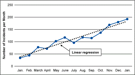
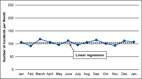
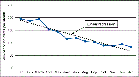
One might wish to make three run charts with trend lines representing the linear regression of each group. This type of view provides a quick visual depiction of which groups are trending toward the positive and which ones are not.


What happens, however, if there are 100, 200 or 500 groups that require a similar type of analysis? The task grows dramatically more difficult. The arduous chore of creating 500 run charts with trend lines is daunting. And after the charts are complete there is still the task of comparing those 500 charts to see which has the most pronounced trends. A much easier and faster solution can be found in TaaG analysis and the construction of a TaaG table.
Building a TaaG Table
As you look at the charts above, notice that each chart can be represented by two key values:
- The arithmetic mean of the data points
- The slope of the linear regression
Although the average of the three groups is fairly similar, the slopes of the three trend lines are different. Group 1 has a slope that is a positive value, Group 2 has a slope of almost zero and Group 3 has a slope that is a negative value.
A TaaG table is simply a table (like Table 1) which lists all the data points pertaining to the individual groups, with the addition of their arithmetic means and slopes added. Although the equation for each of these two numbers is listed below, the easiest way to calculate them is to simply use the functions already built into your favorite spreadsheet or statistics software.


The following is an excerpt of an example TaaG table with 500 groups.
| Table 2: TaaG Table with 500 Data Groups | |||||||||||||||
| Jan. | Feb. | March | April | May | June | July | Aug. | Sept. | Oct. | Nov. | Dec. | Jan. | Mean | Slope | |
| Group 1 | 4 | 1 | 3 | 6 | 3 | 2 | 2 | 4 | 2 | 7 | 8 | 8 | 1 | 3.92 | 0.22 |
| Group 2 | 6 | 7 | 5 | 4 | 4 | 4 | 5 | 6 | 5 | 3 | 2 | 6 | 7 | 4.92 | -0.05 |
| Group 3 | 4 | 7 | 8 | 3 | 3 | 3 | 1 | 7 | 2 | 0 | 2 | 0 | 0 | 3.08 | -0.49 |
| Group 4 | 17 | 8 | 6 | 5 | 6 | 1 | 1 | 7 | 0 | 4 | 1 | 0 | 0 | 4.31 | -0.94 |
| Group 5 | 0 | 4 | 1 | 2 | 1 | 0 | 6 | 1 | 5 | 8 | 4 | 10 | 12 | 4.15 | 0.77 |
| Group 6 | 2 | 0 | 1 | 4 | 3 | 3 | 3 | 4 | 7 | 6 | 10 | 15 | 1 | 4.54 | 0.66 |
| Groups 7-497 not shown | |||||||||||||||
| Group 497 | 11 | 13 | 7 | 14 | 17 | 7 | 11 | 7 | 14 | 6 | 5 | 6 | 10 | 9.85 | -0.43 |
| Group 498 | 11 | 9 | 8 | 6 | 4 | 2 | 0 | 4 | 7 | 4 | 5 | 0 | 0 | 4.62 | -0.66 |
| Group 499 | 12 | 8 | 4 | 3 | 5 | 6 | 5 | 2 | 0 | 1 | 3 | 0 | 1 | 3.85 | -0.71 |
| Group 500 | 0 | 1 | 1 | 6 | 4 | 2 | 1 | 7 | 0 | 3 | 0 | 11 | 8 | 3.38 | 0.45 |
Once the data is in this format it is easy to sort the data by slope to see which group has the most prominent trends. For example, below is the sorted table showing the top 10 most prominently trending groups from the whole data set.
| Table 3: TaaG Table Sorted by Slope | |||||||||||||||
| Jan. | Feb. | March | April | May | June | July | Aug. | Sept. | Oct. | Nov. | Dec. | Jan. | Mean | Slope | |
| Group 316 | 34 | 44 | 77 | 70 | 101 | 117 | 95 | 117 | 114 | 137 | 168 | 180 | 38 | 99.38 | 7.12 |
| Group 160 | 1 | 4 | 6 | 15 | 12 | 14 | 26 | 26 | 32 | 33 | 32 | 37 | 48 | 22.00 | 3.61 |
| Group 115 | 3 | 10 | 7 | 16 | 17 | 16 | 22 | 29 | 23 | 20 | 32 | 40 | 53 | 22.15 | 3.23 |
| Group 135 | 2 | 4 | 5 | 12 | 11 | 13 | 16 | 15 | 26 | 30 | 35 | 29 | 42 | 18.46 | 3.14 |
| Group 310 | 3 | 5 | 5 | 10 | 15 | 17 | 17 | 23 | 15 | 26 | 28 | 34 | 43 | 18.54 | 2.92 |
| Group 225 | 4 | 3 | 6 | 9 | 11 | 19 | 14 | 18 | 19 | 26 | 22 | 37 | 42 | 17.69 | 2.90 |
| Group 275 | 2 | 5 | 6 | 10 | 8 | 9 | 14 | 15 | 28 | 30 | 23 | 32 | 31 | 16.38 | 2.65 |
| Group 340 | 2 | 5 | 7 | 12 | 9 | 13 | 14 | 20 | 22 | 13 | 30 | 30 | 40 | 16.69 | 2.64 |
| Group 235 | 1 | 3 | 8 | 5 | 17 | 15 | 16 | 14 | 14 | 27 | 33 | 29 | 32 | 16.46 | 2.61 |
| Group 190 | 1 | 8 | 8 | 11 | 13 | 12 | 17 | 14 | 19 | 25 | 17 | 28 | 43 | 16.62 | 2.44 |
In this view you can see that far and away the most significant trend is from Group 316. The slope of 7.12 for this group signifies that on average, for the past 13 months, they have increased to just over seven incidents each month. Since these incidents are negative incidents, this represents a worsening trend. Why is this group having a greater impact than the others? The insight from a TaaG table will help guide a Six Sigma practitioner toward which subsets of data are driving the greatest need for improvement.
It is easy to quickly sort the data using normal spreadsheet software. The analysis is easily repeatable if data is gathered on a regular basis (for example, monthly reporting). This makes TaaG analysis ideal for the Control phase of improvement efforts as well as the Measure phase.
Studying Relative Slope
Another aspect of TaaG analysis that can be valuable is the study of relative slope. With large groups of data, it is likely that some subgroups will trend more significantly than others. The trend relative to the normal performance of that subgroup, however, may be better than other subgroups.
For example, consider the data in Table 3 above. Group 316 has the most significant trend at 7.12, with a mean of 99.38, whereas the second group (Group 160) has a “better” trend of 3.61 and a mean of 22.00. It is noteworthy to consider that while the overall trend of the first group is worse, its trend relative to its mean performance is better. To highlight this point consider Table 4 where the relative slope equals slope/mean.
| Table 4: Subgroups of Relative Slopes | |||
| Mean | Slope | Relative Slope | |
| Group 316 | 99.38 | 7.12 | 0.01716 |
| Group 160 | 22.00 | 3.61 | 0.1641 |
While Group 316 has a “worse” trend, it represents about 7 percent of its mean monthly performance, whereas Group 160 represents about 16 percent of its mean monthly performance. At times it is valuable to sort a TaaG table by the relative slope instead of the slope to see which subgroups of the whole data set are trending the most poorly – relative to their individual performance. Table 5 is an example from the same data set used in Table 4 – except it is sorted by relative slope; Table 5 shows the 10 subgroups out of the 500 that have the greatest relative slopes.
| Table 5: Subgroups with Greatest Relative Slopes | ||||||||||||||||
| Jan. | Feb. | March | April | May | June | July | Aug. | Sept. | Oct. | Nov. | Dec. | Jan. | Mean | Slope | Relative Slope | |
| Group 425 | 0 | 0 | 0 | 3 | 1 | 2 | 5 | 3 | 5 | 12 | 9 | 5 | 10 | 4.23 | 0.86 | 0.2039 |
| Group 440 | 0 | 0 | 0 | 2 | 3 | 1 | 4 | 9 | 1 | 7 | 8 | 8 | 10 | 4.08 | 0.83 | 0.2035 |
| Group 5 | 1 | 1 | 1 | 1 | 0 | 4 | 3 | 5 | 4 | 7 | 9 | 7 | 12 | 4.23 | 0.85 | 0.2013 |
| Group 465 | 1 | 0 | 5 | 7 | 3 | 6 | 11 | 11 | 15 | 17 | 18 | 32 | 26 | 11.69 | 2.31 | 0.1978 |
| Group 245 | 1 | 1 | 0 | 2 | 2 | 3 | 3 | 3 | 5 | 5 | 5 | 9 | 12 | 3.92 | 0.77 | 0.1975 |
| Group 80 | 0 | 0 | 2 | 1 | 5 | 4 | 5 | 2 | 5 | 8 | 8 | 12 | 11 | 4.85 | 0.93 | 0.1916 |
| Group 90 | 0 | 1 | 1 | 0 | 4 | 4 | 4 | 3 | 7 | 6 | 5 | 7 | 12 | 4.15 | 0.77 | 0.1865 |
| Group 185 | 0 | 0 | 2 | 5 | 7 | 6 | 5 | 5 | 14 | 9 | 13 | 12 | 22 | 7.69 | 1.43 | 0.1864 |
| Group 320 | 1 | 2 | 1 | 0 | 3 | 5 | 3 | 2 | 3 | 5 | 15 | 7 | 10 | 4.38 | 0.81 | 0.1842 |
| Group 210 | 0 | 0 | 1 | 1 | 3 | 2 | 4 | 4 | 6 | 4 | 7 | 7 | 7 | 3.54 | 0.65 | 0.1832 |
Note that there is no overlap between the two tables of top 10 subgroups. Although the subgroups with the highest relative slopes do not appear to have as significant an effect on the total data set as a whole, taking notice of relative slopes can often bring insight to poorly trending subgroups. That notice, in turn, can result in movements toward improvement.
Trending – Better or Worse
Note in the examples above the higher the positive value of slope, the “worse” the trend because the data set represents the set of negative incidents occurring. If a subgroup has an increase in incidents, this is an increase in negative impact. However, if the data set is, for example, something like stock prices, the higher the slope the better – it represents increasing stock value.
Therefore, when considering the use of a TaaG table in analysis, take note of the data set and whether positive slopes are “good” or “bad” and sort the TaaG table accordingly.
Summary
TaaG analysis can be useful if there is a need to quickly and easily evaluate large amounts of data and compare trends across subsets of data. In whatever industry the improvement opportunity may exist, TaaG analysis provides a rapid first look at a data set to guide the practitioner into deeper analysis toward the root causes of issues and then enable corrective actions.