Retention is a behavior. Satisfaction is a feeling. Loyalty is a measure of the potential for retention. One health plan organization has used the analysis of a simple voice of the customer (VOC) survey to find the drivers and the relationship between loyalty and retention. While a health plan has many opportunities to improve operational efficiencies, this loyalty analysis is aimed at helping focus Six Sigma DMAIC, Design for Six Sigma (DFSS) and Lean projects to improve subscriber retention.
The analysis methods are best described using data to illustrate the calculations. The data used here is hypothetical.
The Survey
The loyalty score is figured on the basis of three questions that subscribers to the health plan answer using a scale of 0 to 10, with 10 being most positive and 0 being most negative. The questions are:
- Do you intend to re-enroll?
- Would you recommend the plan to family and friends?
- Does the plan meet your expectations?
Subscribers are considered loyal if they score 8 to 10 on all three loyalty questions and are considered disloyal if they score 0 to 4 on any one question. Satisfaction is evaluated for the drivers of loyalty – quality of care, access to care, customer service, claims payment and communication from the health plan. Similarly, the drivers are coded as satisfied if they score 8 to 10 and as dissatisfied if they score 0 to 4. Remaining scores and blanks are coded as apathetic. Finally, a comment section asks the subscriber how the plan can serve them better.
| Customer Service and Loyalty | ||||
| Customer Service | Loyalty | |||
| Disloyal | Apathetic | Loyal | Total | |
| Dissatisfied Count Percent of Row Chi Square Contrib. |
80 42 328.93 |
87 46 3.79 |
24 13 64.29 |
191 100 |
| Apathetic Count Percent of Row Chi Square Contrib. |
43 7 0 |
398 66 134.08 |
166 27 88.83 |
607 100 |
| Satisfied Count Percent of Row Chi Square Contrib. |
14 1 55.19 |
234 20 85.04 |
898 78 102.67 |
1,146 100 |
| Total | 137 7 |
719 37 |
1,088 56 |
1,944 100 |
| Pearson Chi-Square = 862.820 / DF = 4 / p-Value = 0.000 | ||||
Comments are coded into three hierarchical categories. The top level corresponds to the five drivers plus cost, benefits and a miscellaneous category. Each category is split into subcategories that are more specific. For example, customer service (CS) has subcategories of “Medical Office CS,” “Health Plan CS,” “Doctor CS,” etc. Some larger subcategories are further divided to clarify the issue.
The Database
The survey data are joined to demographic information such as marital status, age, county, tenure in the health plan and employer group type. Medical utilization is summarized by family level counts of provider, facility and pharmacy claims. The demographic, utilization and customer service call categories will be referred to as the demographic variables and many of these are coded into a variety of rollups (or category levels) to reduce ad hoc recoding. For example, Tenure 2 has two category levels – six months to three years and more than three years with the plan. Similarly, Tenure 3 has three categories. It also is important to track the disenrollment of survey responders and the non-responders.
The Chi Square Analysis
The main database is split into an analytic data set depending on the request. The first step is to perform chi square cross-tab tables of loyalty by all survey questions (drivers) and the demographic variables. By convention, the outcome (loyalty or disenrollment) is in the column of a cross-tab and the explanatory variable (the driver or demographic) is in the row. Again by convention, if the chi square p value is less than 0.05, then the explanatory variable is considered to have a significant influence on the outcome. If the influence is significant, then the loyalty and disloyalty row percentages are compared to the total row percentage.
Row percentage distribution and the cell’s contribution to the Pearson chi square statistic are both valuable statistics that can be used to identify which cells are contributing to the significant result. In Table 1 for example, 42 percent of those who are dissatisfied with customer service are disloyal. This cell provides the greatest contribution to the chi square with a value of 328.93. Also note that the overall loyalty is 56 percent, but those satisfied with customer service have a loyalty of 78 percent and those dissatisfied with customer service have a loyalty of 13 percent, therefore, it is clear that customer service is important. Whereas, if those satisfied with customer service had 61 percent loyalty and those dissatisfied with customer service had 58 percent loyalty, then customer service would be a less important factor.
A full set of cross-tabs serves a number of purposes. Missing values or odd results are easily identified. They also help with the identification and interpretation of the logistic regression results. Recall that most of demographic variables have a number of levels, such as Tenure 2 and Tenure 3. Some of these levels may have small cell counts (less than five) and others may roll up the data into insignificant categories. The best roll-up level can be chosen by reviewing the cross-tabs. Non-significant variables can be ruled out and do not need to be included in the logistic model. Choose only one categorization for each variable in a logistic model; for instance, do not use both Tenure 2 and Tenure 3.
The Logistic Regression Analysis
The cross-tabs help to identify what the base should be for the logistic factors. For example, a loyalty logistic regression answers the question of what the odds of being loyal are if the subscriber is satisfied with customer service, compared to the odds of being loyal if the subscriber is dissatisfied with customer service.
The math is more complicated, but think of it as a ratio of the percentages presented in the first customer service example above: 78 percent divided by 13 percent equals 6. Interpret this as those satisfied with customer service are six times more likely to be loyal than those dissatisfied with customer service. The base or denominator, therefore, is important for interpretation. Most statistical programs choose the base according to ascending or descending alpha of the category names. Therefore, it is a good practice to rename the categories so the analyst selects the base.
Consider for example, the customer service variable with the following categories “dissatisfied,” “apathetic” and “satisfied.” If the statistical program chooses an ascending alpha, it will select apathetic as the base. This could pose two problems. First, it makes the interpretation a bit tricky, because the odds ratio of loyalty for those satisfied compared to those apathetic is greater than one (78 / 27 = 2.9) and the odds ratio of loyalty for those dissatisfied compared those apathetic will be less than one (13 / 27 = 0.5). Second, there may not be statistical difference between apathetic and satisfied, but there may be a difference between satisfied and dissatisfied. Also, it is not always obvious which level should be the base. By looking to the loyalty row percentages in the cross-tabs, it is easy to identify the category with the lowest percentage of loyalty. Rename this category as the base so that the odds of loyalty are relative to this and will therefore be greater than one.
Since the drivers tend to be more highly correlated with loyalty, it is usually best to run the drivers and demographics in separate logistic models.
Interpreting Comments and Identifying Projects
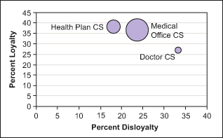
The volume of a particular comment category is not necessarily a good indicator of its influence on loyalty. Comments are best illustrated by a bubble diagram that plots volume as the size of the bubble against the x and y axes percentages of loyalty and disloyalty of those members who made the comment. Big bubbles with high disloyalty and low loyalty are easily identified as targets for Six Sigma projects.
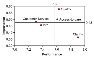
The loyalty drivers can be illustrated in an importance-performance plot. Using the raw data from 0 to 10, calculate the average of each driver (performance-x axis). Then calculate the correlation coefficient to loyalty for each driver (importance-y axis). Calculate the average performance and importance score and plot these as reference lines to create four quadrants. The low- performance/high-importance quadrant contains the drivers that the Six Sigma projects must address. The performance/importance plots and bubble diagrams are effective methods to illustrate the statistical work done. These are reinforced with the logistic odds ratio results. For instance, those satisfied with customer service are two times more likely to be loyal compared to those satisfied with quality of care, who are 15 times more likely to be loyal (relative to those dissatisfied).
Adding the three loyalty questions to every survey, such as annual health plan surveys, can help tease apart specific attributes of the key drivers to help further focus Six Sigma projects. Ongoing loyalty analyses can then be presented with confidence to scope and control the DMAIC, DFSS and Lean initiatives designed to improve retention.
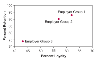
Figures 1, 2 and 3 show ways to provide graphic illustrations of loyalty in order to help identify process improvement projects. Figure 1 plots the relationship between loyalty and retention. Figure 2 shows customer service in the high importance and low performance quadrant; therefore, customer service should be addressed to improve loyalty. Figure 3 charts comments focused on specific items that need to be improved. In this example, “Doctor CS” should be addressed first, even though “Medical Office CS” has the greatest volume.


Relationship Between Loyalty and Retention
The final point is to understand the relationship between retention and loyalty. After two years of survey data, retention rates can start to be compared between loyal and disloyal members to develop a ratio. Statements can be developed, such as disloyal members disenroll twice as often as loyal members. To further understand the retention rates and the survey bias, compare the retention rates of survey responders, non-responders and the overall population by the important demographics. Retention also can be used as an outcome variable in the cross-tabs and logistic.