Among the tried and true tools in the Six Sigma kit, cause-and-effect diagrams in the simple form of a tree, a fishbone or a Y-to-x diagram are a big help in identifying factors (x’s) that may drive changes in a results variable of interest (Y). There are times, though, that a flat, two-dimensional hierarchy does not convey the intertwined nature of factors and their interactions.
System dynamics, pioneered by Jay W. Forrester and significantly advanced by Peter Senge, is a discipline that pays special attention to complex cause-and-effect relationships. From that discipline has evolved the use of causal loop diagrams to pick up where tree diagrams leave off – conveying a web of causal interconnections that sometimes do a better job reflecting the way things are.
Software Development Project Duration and Cost – Y-to-x View
In any software project, the three fundamental questions (and big Y’s) are:
- How long will it take? (duration)
- How much will it cost? (effort and acquisition costs)
- How good will it be? (performance or defects)
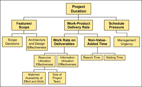
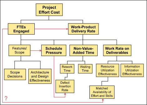
Even the beginning of a Y-to-x tree diagram for any of those result measures becomes rather complex. Figures 1 and 2 illustrate the start of Y-to-x trees for development duration and development effort cost.


Observations on the Y-to-x Tree
Even the simple detail in Figures 1 and 2, shows considerable “overlap,” with several common factors appearing in each. While the same factors show up, it is worth noting that the strength and direction of effect for these factors may be quite different in each tree. For example, schedule pressure has a weak reducing effect on project duration. It takes a lot of pressure to make a small difference in schedule. Yet schedule pressure has a strong increasing effect on project effort cost.a

Figure 3 begins to show some complexity that may better reflect the way things really are. Causal connections do not just flow from the bottom of the tree to the top. Factors may influence one another (laterally) and some may even loop back, as indicated by employees measured as full-time equivalents (FTEs) engaged.
Enter the Causal Loop Diagrams
People with insight into system dynamics recognized that cause-and-effect cycles and webs are a natural form for expressing the tangles that show up in many systems.
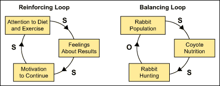
A few comments about common notational symbols provide a feel for the way that causal loop diagrams help describe causal or driving relationships. A causal loop diagram shows factors, in circles or boxes, connected with directional arrows or arcs. Consistent with common sense, the head of an arrow denotes an effect or result and the tail represents a cause or driving factor. A symbol (+/- or s for same and o for opposite) appears on each arc to denote the direction of the driving relationship. Figure 4 illustrates that. As attention to diet and exercise increases (cause or driver) feelings about results (effect) goes in the same direction. As rabbit hunting increases, the rabbit population moves in the opposite direction.

Reinforcing or Balancing Loops
Directional arcs can be connected in various ways to form webs and loops. Figure 5 shows two simple loops that bring out two more causal loop diagram definitions. Loops that have zero or an even number of opposite arcs are called reinforcing. Such a loop will feed on itself, as a vicious or virtuous circle, spiraling up or down if not checked. The Reinforcing Loop reinforces in either sense – for example, when attention to diet and exercise increases, all the other factors in the loop increase, reinforcing the positive in that case. If attention to diet and exercise decreases, the other factors decrease, and the system spirals down to the negative. The other loop, with an odd number of o arcs, is a Balancing Loop. As the rabbit population increases, coyotes become better fed and hunting increases, which results in a decrease in the rabbit population.

Software Project Dynamics and Archetypes
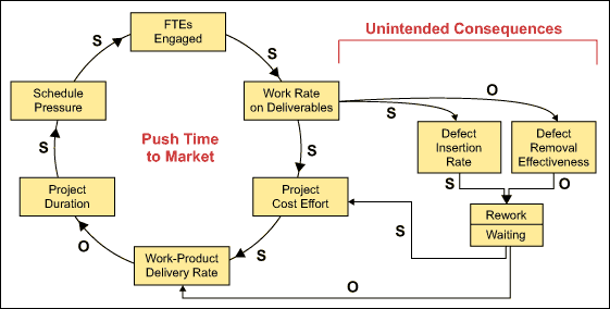
Figure 6 portrays a few key factors from the effort and duration Y-to-x trees in causal loop form. This provides an example of another useful aspect of the work that has developed in system dynamics and causal loop diagrams. People creating and assessing causal loop diagrams in many different fields noticed recurring patterns in the loop dynamics.
A number of interesting archetypes have been identified – among them a pattern sometimes called “the fix that fails.” While the factor names may be very different, reflecting an application domain, the pattern is a main loop describing a policy with a particular intent. In Figure 6 the loop labeled Push Time to Market shows that intent. It is deployed by increasing schedule pressure, engaging more FTEs, increasing work rate on deliverables, and so forth. At first it may appear the work-product delivery rate increases, project duration decreases and there would be some relief on the schedule pressure. That is the “fix.” This archetype, however, has a secondary and unintended loop that works against the intent of original policy.
Figure 6 depicts what is known about a schedule being pushed by simply adding people and working faster: That is, as work rate on deliverables increases, defect insertion rate moves in the same direction (s) and defect removal effectiveness decreases (o), rework and waiting time increase, as does project effort cost. Thus work-product delivery rate goes down. That is the “fail.”

Conclusion: Simple Examples Touch the Core
This is a short introduction to a topic that is wide and deep. Yet, these simple examples touch on dynamics that are at the core of current discussions about Lean software development and Agile methods – as they seek to remove wasted time and effort to get the best delivery time and quality levels at minimum project cost.