
Having developed a good understanding of the project’s business case and customer requirements (identifying the Y‘s), and the as-is process, the Six Sigma project team of the IT services business began to focus on the Measure phase. The team identified the measures and data collection plan for gathering the right amount of the right data to impel their learning about root causes and drivers that impact the project Y‘s.
The DMAIC (Define, Measure, Analyze, Improve, Control) roadmap called for work in these areas during the Measure phase:
M1. Refine the Project Y‘s: Getting even clearer about how the project’s key outcome measure(s) will be defined, measured and reported.
M2. Define Performance Standards for the Y‘s: Identifying how performance will be measured – usually somewhere on the continuum from capability measures like Cp and Cpk for “variables” data that is normally distributed to percentile or other capability metrics for “attribute” and other data that may be skewed in distribution.
M3. Identify Segmentation Factors for Data Collection Plan: Starting with the natural segmentation of project Y‘s and moving though consideration of prospective driving factors (X‘s), segmentation suggests the packets of data that should be collected in order compare and contrast segments to shed light on Y root causes and drivers.
M4. Apply Measurement Systems Analysis (MSA): In any project, raw data is gathered and then converted into measures. That process comprises a “measurement system” that should be characterized and strengthened in terms of its accuracy and repeatability.
M5. Collect the Data: Gathering data, preserving its meaning and noting any departures from the discipline put in place under MSA.
M6. Describe and Display Variation in Current Performance: Taking an initial look at the data for its distribution, extreme values and patterns that suggest special variation.
M1. Refine the Project Y‘s
During this step the team conisdered exactly how the project Y‘s would be defined and measured:
| Y‘s | Measurement | |
| Primary | Customer Satisfaction | 1. By industry standard monthly survey 2. The project will require additional, more frequent, case-by-case customer satisfaction data. A measurement system that tracks with the industry survey will be devised and validated. |
| Secondary | Support Cost (Per Call) | The staff time connected with each call: – Call answering and discussion – Case research – Callback time will be loaded with a distribution of benefits and infrastructure costs to compute overall support cost per call. |
| Related / of Interest | Days to Close | Time span from call origination through client indication that the issue is closed to their satisfaction. |
| Wait Time | Automatically tracked for calls in queue. Summed for calls encountering multiple transfers. | |
| Transfers | Automatically tracked for each call moved to another extension. | |
| Service Time | Automatically tracked for time from staff call pickup until hangup or transfer. |
M2. Define Performance Standards for the Y(s)
For each project Y, the current baseline and best-estimate target was documented. In some cases, the team found that good baseline data was unavailable. (Unfortunately that is a common occurrence in DMAIC projects.)
| Measure | Current Baseline | Target | |
| Primary | Customer satisfaction (Per Collins Industry Assessment) | 90th percentile / 70-80 percent satisfied | 90th percentile / 85 percent satisfied |
| Secondary | Support cost per call | 90th percentile / $40 | 90th percentile / $32 |
| Related / of Interest | Days to close | Did not have good baseline data | 90th percentile / 3 days or less |
| Wait time | Did not have good baseline data | 90th percentile / 4 minutes | |
| Transfers | Did not have good baseline data | 90th percentile / 2 | |
| Service time | Did not have good baseline data | Mean: < 8 minutes St.Dev.: < 0.5 minutes |
M3. Identify Segmentation Factors for Data Collection Plan
The first question was: How is Y naturally segmented? Often Y data is organized by customer type, geographic region, product or service type, etc. Thinking about where the strongest “action” was for the dynamics under study, the team focused its initial data collection effort on the segment(s) that offered the most potential for the team’s learning. This helped conserve the limited resources available for data collection and analysis. Instead of “measuring everywhere,” the team started with a focused subset of all possible data. The data was naturally segmented by call center – with most of the traffic in one center. Data from that site was used for the initial data collection.
The next question was: What factors may be driving the Y‘s? Identifying these factors and gathering data on their behavior may shed light on the root causes and drivers for the Y‘s. This is the planning part of the Six Sigma drill-down that is sometimes called “peeling the onion.” While the fundamental interest is in the Y behavior, the idea is not to truly solve a problem by trying to “fix the Y.” That approach might provide a temporary fix. Understanding the underlying drivers (the x’s) offers the possibility of addressing the root cause, and fixing the problem so that it will stay fixed.
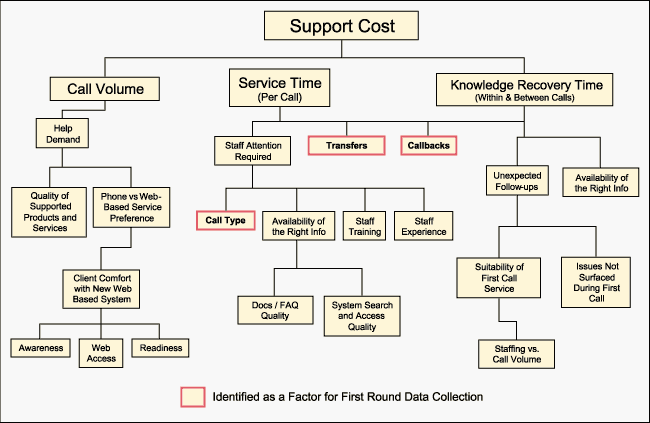
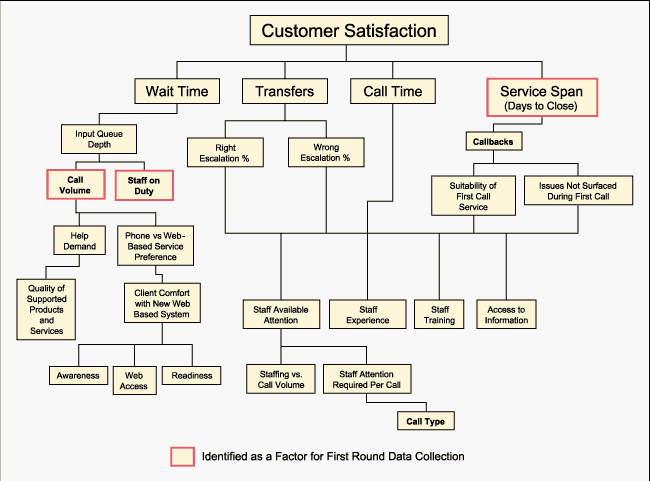
A Y-to-X tree depicts the array of lower level x’s that may be driving a Y. Other tools with a similar thrust – cause-and-effect diagrams and cause-and-effect matrices (illustrated later) – can be helpful in identifying and prioritizing the prospective X‘s for data collection and study.
The team’s Y-to-X trees for support cost and customer satisfaction are shown in Figures 1 and 2.
Input-Output Analysis
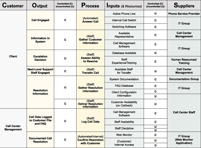
Building on the information developed in the SIPOC / COPIS table, the team reviewed process inputs and outputs, classifying each as “controlled” (with process provisions in place to measure and influence that input or output, if necessary) or “uncontrolled” (with no such provisions in place). See Figure 3.
Cause-and-Effect Matrix
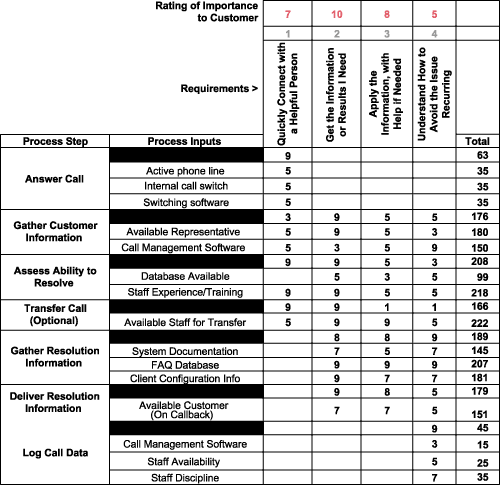
To further explore potentially influential factors, the team created a cause-and-effect matrix (Figure 4). The high scoring items in this analysis were strongly considered for data collection. The highest, “Available Staff for Transfer,” was included. The next highest scoring, “Staff Experience/Training” was not readily available in the historic database. (There had been reluctance to log personal data as part of the ongoing call logging.)
M4. Apply Measurement Systems Analysis (MSA)
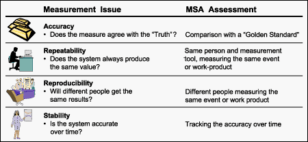
To prepare for the measures to be collected in the next step, the team reviewed the measurement systems. In transactional processes, any activity that gathers raw data and converts it into counts, classifications, numbers or other forms of measure is a “measurement system.” While the statistical methodology connected with MSA is beyond the scope of this article , Figure 5 depicts the four questions that are usually posed for measurement systems in transactional processes. Viewed simply, the intent of MSA is to strengthen a measurement system so that it is suitably accurate, repeatable, reproducible and stable. A fifth issue, “linearity” (the accuracy of the system over the range of mesaured values), is sometimes considered.
M5. Collect the Data
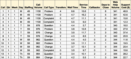
A plan was formulated to gather data from the past year’s database. This required retrieving call data, as well as tracing call resolution times, staffing levels, call volume levels and relevant follow-up events. For each call sampled, the team rebuilt information about staffing, call type, number of transfers, wait time, etc. (Figure 6)
M6. Describe and Display Variation in Current Performance
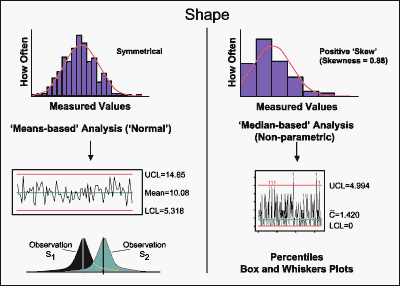
A first look at the data coming in provided the team insights about extreme values and patterns suggesting problems with the measurement system. With the information, the team began to forecast what the Analyze phase would reveal. The team’s question at this point was: How is the Y distributed? The team looked for the layout of measured values collected – for symmetry and for extreme values. This suggested the kinds of graphical and statistical analysis that would be appropriate (Figure 7).
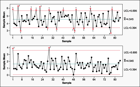
Data on the call center X measures was graphed and charted a number of ways. Figure 8 shows the variation in customer Wait Times on an Xbar-R control chart. Variation above and below the chart’s control limits suggested that there were “special causes” in play – worth understanding in more detail by the team in the Analyze phase.
Part 4 is about the Analyze phase of the project.