
Key Points
- X-bar and R charts are useful control charts for use with rational subgroups.
- X-bar measure between-sample variation.
- R charts measure within-sample variation.
All processes vary. The data you collect from your process will vary. But is the variation common to the elements of your process or something special? If your data is continuous or variable data, the X-bar and R charts will tell you.
In this article, we will discuss what the X-bar/R charts are, how they are constructed, their benefits, and best practices for using them.
What Are X-Bar and R Charts?

The control chart was developed by Dr. Walter A. Shewhart, an American physicist, engineer, and statistician, who is sometimes referred to as the father of statistical quality control.
While employed at Western Electric and Bell Laboratories, Shewhart became aware that operators frequently adjusted their processes when the process appeared to vary from the nominal value. This constant tampering with the process without knowing whether the variation was due to an assignable cause or the natural random variation existing in all processes was a problem.
Shewhart defined his concern in terms of assignable or special cause and random or common cause variation. The control chart was developed to help distinguish between the two. The actions one takes will depend on the type of variation. For common cause variation, the action is to work on improving the process by reducing the variation or moving the process average. For special cause variation, the correct response is to try and find the root cause of the unexpected variation and either incorporate or eliminate the cause depending on whether the special variation improved or degraded the process.
Defining Them
X-bar/R charts are a pair of control charts where continuous or variable data is collected in rational subgroups. The X-bar chart measures between-sample variation (signal), while the R chart measures within-sample variation (noise). Here is some further information about the charts.
- The Xbar & R chart is the most commonly used control chart
- Consists of two charts displaying central tendency and variability
- Xbar chart:
- Plots the mean (average) of each subgroup to see between-sample variation
- Useful for identifying special cause changes to the process mean (Xbar)
- Control limits, related to +/- 3 standard deviations, are calculated using the Range chart (Rbar)
- R chart:
- Displays changes in the within subgroup variation
Below are some further descriptions and formulas for calculating the values on the X-bar/R charts.
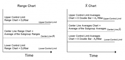
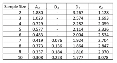
In the formulas above, you see mention of the constants A2, D4, and D3. Here is the table where the value of the constants are taken from based on the size of the subgroup or sample. For example, if your sample size was 7, you would use 0.419, 1.924, and 0.076, respectively, for A2, D4, and D3.
How to Construct Your Own
Here are the steps for constructing the X-bar/R charts.
- Determine an appropriate subgroup size and sampling plan.
- Collect your data (take a set of readings at each specified interval of time).
- Calculate the average and range for each subgroup.
- Plot the data (both the averages and the ranges).
- After 20 or more sets of measurements, calculate control limits for the R chart.
- If the R chart is not in control, take appropriate action and investigate.
- If the R chart is in control, calculate control limits for the X-bar chart.
- If the X-bar chart is not in control, take appropriate action and investigate.
- If both charts are now in control, extend the control limits for ongoing monitoring.
An important consideration in using X-bar/R charts is the selection of an appropriate subgroup or sample size.
Rational subgrouping is the process of selecting a subgroup based on logical grouping criteria or statistical considerations. The purpose of subgrouping is to minimize the within-sample variation to maximize the ability to see between-sample variation.
Do not create subgroups for convenience. There must be some logic and rationale for the subgroups. Do not artificially subgroup data to dampen or reduce apparent variation.
Once you have constructed your X-bar/R charts, you’ll need to interpret what they are telling you about your process.
Interpretation
Here are the guidelines for interpreting them:
- To correctly interpret X-bar/R charts, always examine the R chart first.
- The X-bar chart control limits are derived from the R-bar (average range) values. If the values are out of control in the R chart, then the X-bar chart control limits may not be accurate.
- If the points are out of control in the R chart, then stop the process, identify the special cause, and address the issue. Remove those subgroups from the calculations.
- Once the R chart is in control, then review the X-bar chart and interpret the points against the control limits and the Western Electric Rules.
- All the points should be interpreted against control limits, not specification limits. Specification limits are provided by the customer or management, whereas control limits are calculated from the average and range values of the subgroups. Spec limits should not appear on your control chart.
- If any point is out of control in the X-bar chart, identify the special cause and address the issue.
- Process capability studies can be performed only after both the X-bar and R-chart values are signaling common cause variation.
Does Data Need to Be Normal?
When it comes to using X-bar and R charts in your statistical analysis, a common misconception is that the data needs to conform to a normal distribution. However, this isn’t the case. You can run this on samples that don’t conform to a normal distribution with ease, provided they are on the smaller side.
Benefits of Using X-Bar and R Charts
Tampering with a process in statistical control will increase your variation and degrade your quality. The X-bar/R charts will provide the following benefits and keep you from tampering.
Knowing When to Intervene in a Process
If your X-bar/R charts give you a signal of special cause variation, you should investigate and react accordingly. Otherwise, don’t chase individual values that seem to be different.
Provides a View of the Process
The X-bar/R charts show the process changes over time. It will indicate what has changed and what has not changed.
Easy to Understand and Construct
The concept of the control chart was first introduced in the early 1920s and was intended to help people understand when to react to a data point and when not to react. In many cases, the calculations and construction of the control chart were done at the operating level. This required the control chart to be simple to create and maintain.
Why Are X-Bar and R Charts Important to Understand?

X-bar/R charts provide valuable information about your process. Understanding what they are telling you is important for taking the appropriate action.
Alerts You to What Has Changed and What Hasn’t In Your Processes
If the X-bar/R charts exhibit common cause variation, then there has been no significant change in the process. If nothing has changed, don’t chase reasons for a single data point that seems different. Focus on improving the process by reducing variation or shifting the average as appropriate. If there are signals of special cause variation, then investigate to try and find the root cause of the change.
Defines Out of Control
X-bar/R charts are considered in control if all the data points are within the control limits and exhibit random variation. While you might have data points within the control limits, they may be defined as out of control if they violate one or more of the Western Electric Rules for non-random patterns.
Rational Subgroups
How you select your sample and how big of a sample you use will have an impact on the value of your X-bar/R charts. Take care to properly define your rational subgroup and collect your data in a manner to optimize the signals your charts will give you about your process.
An Industry Example of X-Bar and R Charts
The Master Black Belt (MBB) of a steel manufacturing plant was reviewing the data from the mold coating process. He was perplexed because almost all of the values were 150 microns in thickness, which happened to be the nominal value for the process.
Data was collected and recorded by the operator, so he went to speak to one. He was told operators often put down the 150-micron value because any other value would have their supervisor coming over and asking, “What happened?” The supervisor didn’t understand the concept of process variation.
The MBB convinced the plant manager to start using X-bar/R charts to monitor the process. They chose to sample the process 5 times an hour for one week. He also got assurance the operators could record the true values without any repercussions from their supervisor.
Below are the X-bar/R charts from the process data.
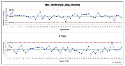
As you can see, except for a single data point on the R chart, the process looks to be exhibiting common cause variation. Chasing a high or low value as exists for points 15 and 26 is chasing the natural variation of the process.
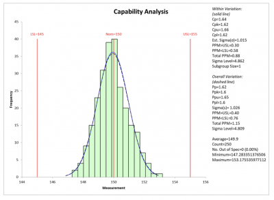
The next step would be to examine the process capability. Using a nominal of 150 plus/minus 5 micros as the specifications you can see the process, while stable and in control, is not capable of meeting the required specs. While the process is centered, an effort should be made to reduce the variation of the process.
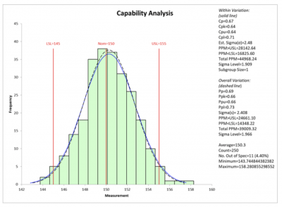
A team was formed to analyze the mold coating process, and it was determined that the flow speed of the powder, air pressure, and nozzle setting needed to be adjusted to reduce the variation.
Collecting the data for an additional week showed an improvement in the process capability.
Best Practices for X-Bar and R Charts
There are many ways to improperly construct and use a control chart. Use these tips to get the most value out of your X-bar/R charts.
Don’t Control Chart Everything
Be sure you use X-bar/R charts to monitor the performance of key process characteristics. Don’t make a control chart for the sake of control charting.
Sampling Strategy
One of the best sampling strategies is to use a consecutive periodic approach, where you collect consecutive units from the process (minimizes the within-sample variation) on a fixed schedule. For example, grab five consecutive bottles from the line every 30 minutes, and test them for carbonation.
Use an X-Bar/S Chart for Larger Samples
The use of the R chart for monitoring the range of small samples (<8) is common. The standard deviation (S) is a more accurate representation of the process variation when samples get larger. Use X-bar/S charts where the S is the standard deviation within a sample rather than the R or range.
Other Useful Tools and Concepts
Looking for other useful tools to bolster your statistical analysis? You might be best served by learning how to implement Fisher’s 1-Way ANOVA in your workflow. This handy ANOVA test works with normally distributed data points to check for variances.
Additionally, you might need to look into the homogeneity of variance. Variances can arise between data sets, but paying attention to the homogeneity of variance allows you to more readily see if those assumptions can be validated.
Conclusion
X-bar/R charts are one of the most powerful tools in the Lean Six Sigma toolbox. The charts provide important information regarding the variation of your process. They are designed to distinguish between common and special cause variation over time. This enables you to properly react to any changes in your process average or variation.