As a manager, you are responsible for managing your process over time, not just at a single instant of time. There are several graphical techniques you can use to do that. The run chart is a simple way to graph your process metrics over time.
Overview: What is a run chart?
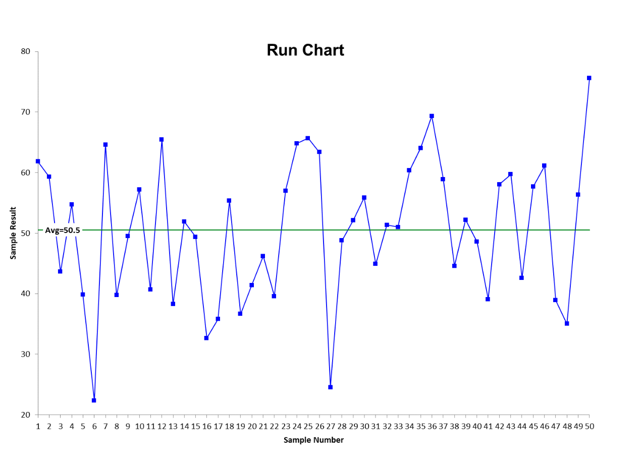
A run chart will help you visualize your process metric over time. The graph of a run chart has a vertical axis representing the values associated with your metric. The horizontal axis is a sequence of order or time. You will place a symbol representing each data point by matching up the value of the data point with the appropriate value on the timeline. You can connect the data points to make it easier to see any trends or patterns. There will also be a horizontal center line representing the mean of the data.
Upon viewing the run chart, you should be able to see any trends going up or down. You will also be able to see certain patterns such as a long run of points above or below the center line. You will be able to see sawtooth or cyclical patterns. Since there is no statistics involved, you are relying on your visual interpretation of what is happening in your process. That is adequate for a quick look.
If you wish to analyze the trends and patterns in a more sophisticated manner, you can apply a Runs Test or even construct an appropriate control chart. The control chart will contain upper and lower control limits and will let you determine whether the process is in statistical control showing only common cause variation or is out of control and demonstrating special cause variation.
Below is a graphic of the format for a run chart.

An industry example of a run chart
The manufacturing manager was not satisfied with looking at his process metrics in an Excel spreadsheet. Since he had received some Six Sigma Green Belt training, he decided to use some statistical software to create a run chart. The visual representation was much easier to understand his process variation compared to numbers in an Excel spreadsheet.
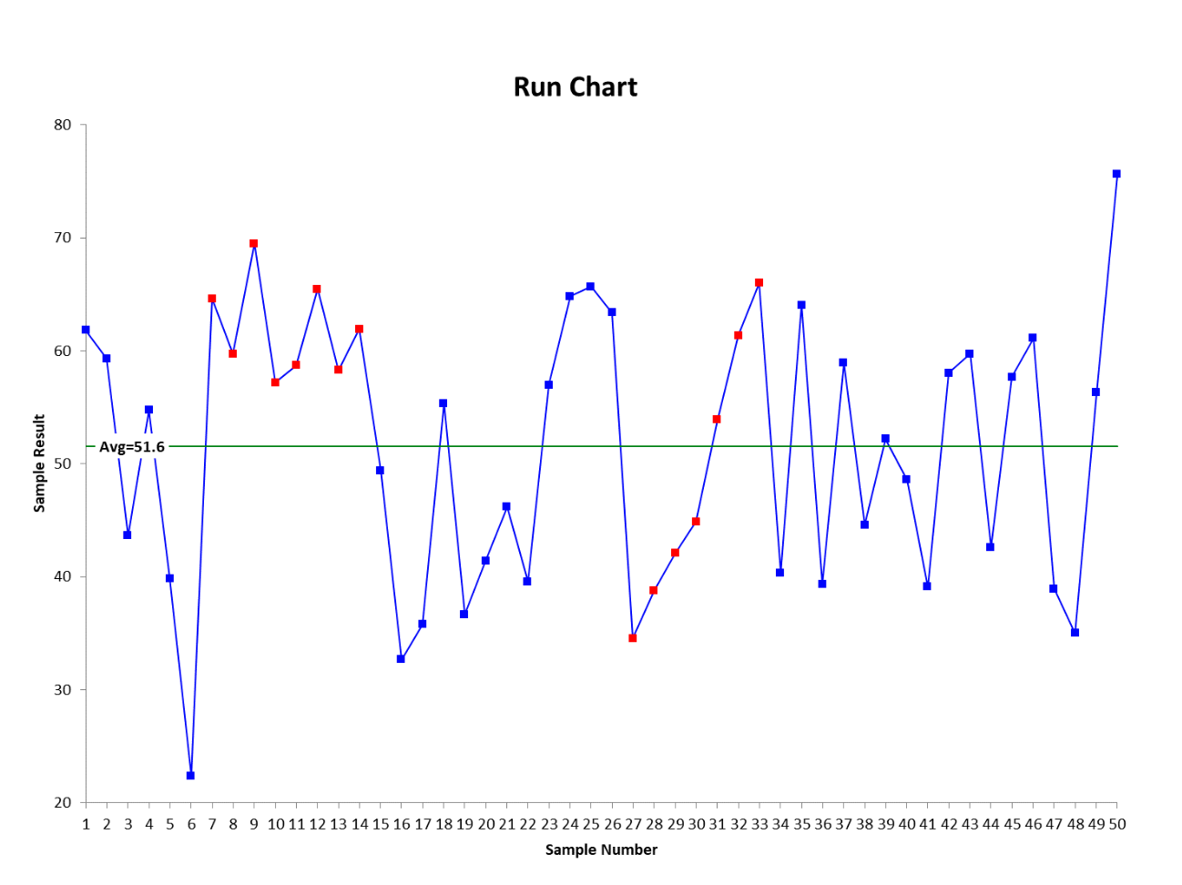
The run chart below shows the change over time for one of his machines. He noted two unusual patterns. One was a run of 7 consecutive points going up and another where there were 8 consecutive points above the centerline. Since this was a measure of turnaround time, the consecutive points all above the centerline was troubling. He put together a small team of supervisors and operators to investigate what might have happened.
Frequently Asked Questions (FAQ) about a run chart
What is a run chart and what is it used for?
A run chart is a time sequenced plotting of process data used to look for obvious trends, patterns and changes in your process over time.
Can a run chart tell me whether I have common or special cause variation?
No. There are no calculated control limits on a run chart. If you want to know the type of variation you have, you will need to use a control chart.
What is considered a run on a run chart?
A run on a run chart is often defined as the number of consecutive points going up or down as well as consecutive points above or below the center line.
