Key Points
- A multi-vari chart is a visual means of seeing multiple variations across a single data set.
- It is not a statistical representation of your data, but rather a visual one.
- While you can generate these with software, you have plenty of tools to generate one without a computer.
Stem and leaf plots, histograms, and frequency distributions are all pictures of your process variation. While they can show variation, they are not useful for understanding the sources of the variation. That’s where multi-vari charts become important. This article will present how to construct a multi-vari chart and explore the benefits of and best practices for using them.
What Is a Multi-Vari Chart?
Although developed independently by a number of people, multi-vari charts were first described by Leonard Seder in 1950. The inspiration for these charts came from charts used to represent the variation in stock prices. Dorian Shainin adopted the multi-vari charts as a way to quickly converge on the root cause of a problem he referred to as the Red X.
A multi-vari chart displays a graphical representation of the relationship between factors, or process input variables, and a response, or process output variable. The quality characteristic of interest is plotted across three horizontal panels representing:
- Variability on a single piece
- Piece-to-piece variability
- Time-to-time variability
A multi-vari chart is a two-axis plot, with time moving on the horizontal, or X-axis from left to right, and the process output or response measurement plotted on the Y, or vertical axis. The multiple measurements of each unit are plotted together. Consecutive measurements are plotted from left to right over time. A break in the horizontal groupings indicates a break in time during the sampling process.
Here is the method for constructing a multi-vari chart:
- Take multiple measurements on each item, and draw them as circles. Different colors can be used for each circle to designate the first, second, and third measurements of the item. Connect the multiple measurements with a solid line to indicate the amount of variation within each item. This will illustrate the variation based on the position of the measurement.
- Plot an average point for each measurement grouping. Averages are drawn as squares.
- Draw a long-dashed line connecting the averages of consecutive measurement groupings. The up-and-down variation of this connecting line illustrates the variation between items.
- Another mark is plotted to show the overall average of the set of consecutive items. A dashed line is drawn between the overall average points. The up-and-down variation of this line shows the variation between breaks in time.
- Vertical lines are drawn to indicate the end of one time frame and the beginning of the next.
- The pattern repeats itself for a minimum of three time frames. Typically, more than three time frames are used. How many will be dependent upon some knowledge of the process variation?
- Each time frame contains the measurements of three consecutive items, but more can be used depending on the variation of the process.
- While each item will consist of a minimum of three measurements, having more may be useful.
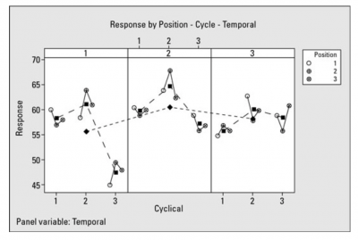
Here is what a completed multi-vari chart might look like:

You can interpret the multi-vari chart by analyzing the pattern of circles and lines. Look at the variation within each item or positional variation. Look at the variation between items, or your cyclical variation. Finally, you can analyze the temporal, or time, variation.
Why Do You Need It?
So, what use is there in a chart that shows multiple variations? While we’ve taken closer looks at other visualization tools, few combine multiple variations to give a comprehensive picture of your process variation. By utilizing three dimensions of variation, you get a better picture of where your process is fluctuating.
Benefits of a Multi-Vari Chart
From a single two-dimensional chart, you can get a tremendous understanding of the source of your process variation.
Three Dimensions of Process Variation
The multi-vari chart allows you to determine whether your variation is due to within-unit variation (repeatability), between-unit variation (reproducibility), or variation over time.
Single Graph
While your decisions will need further statistical analysis to determine significance, the multi-vari chart provides a simple directional guide to your possible sources of process variation.
No Need for a Computer
While statistical and graphical software will make it easier and faster to construct a multi-vari chart, it can be hand-drawn by operators on the line.
Why Is a Multi-Vari Chart Important to Understand?

Here are a few reasons why understanding the use and interpretation of the multi-vari chart is important.
Provides Possible Sources of Process Variation
It is important to understand the various sources of variation in your process. They can be described as within units, between units, or time dependency.
It Is a Graphical Representation
Since the multi-vari chart is a graphical representation, one cannot draw statistical conclusions. It can only be used as a directional indicator. Analysis of Variance (ANOVA) should be used to determine the true statistical significance of your sources of variation.
Used for Continuous Data
Since the technique involves the measurement of items, your data will be continuous, not discrete.
An Industry Example
A label supplier manufactured labels on rolls of adhesive backing strips. A critical characteristic of this process was the strength of adhesion of the labels to the backing strip. If it’s too strong, the labels have difficulty coming loose from the backing strip and cause problems in the label-applying machinery of the company’s customers. If it’s too weak, the labels fall off the products they’re placed on.
Over the previous two months, the variation in label adhesion strength ranged from 0.8 to 6.3 pounds. The wide variation in adhesion strength caused a problem for the customers’ labeling equipment. A cross-functional team was formed to solve this problem.
The team decided to try and understand the source of that variation by using a multi-vari chart. These were the steps they followed:
- Determine the historical level of variation in the process. The historical level of variation in the adhesion performance of the process was 0.8 to 6.3 pounds.
- Define the study unit. Adhesion force couldn’t be measured more than once on a single label, so setting the study unit as a single label wasn’t viable. The team decided to use a five-label section cut off a roll as the unit. That setup could be measured up to five times, so they defined a unit to be a five-label strip off of a roll.
- Collect data from the process. The team decided to start the multi-vari study by taking three consecutive five-label strips from each production shift and then testing all five labels on each of those strips.
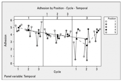
Plotting the data in the positional, cyclical, and temporal groups, they created a graphical multi-vari view of their data. This is what the multi-vari chart looked like.

Here is how the team interpreted the chart:
- The largest magnitude of variation in the process output (adhesion) occurred within single units. Notice the wide variation in the 5 positional measurements, especially in the third grouping on the right.
- The slope of the solid line decreased, showing some temporal issues with adhesion as the day progressed.
- The last group or shift showed the most variation.
- The second shift readings had the least variation.
- There may have been some interaction between the positional and temporal variation since the positional variation increased later in the day.
The team continued its analysis by confirming its interpretation with ANOVA. Root cause analysis was used to finalize the source to be positional. MSA was used to make the measurement system more repeatable with emphasis on the third shift.
Multi-Vari Chart Best Practices

While the construction of a multi-vari chart is relatively simple, there are a few things to keep in mind.
Measurement System Analysis
Since you will be doing physical measurements, you will want to be sure you have validated your measurement system so that sources of variation are not contaminated by the variation in your measurement system itself.
Use Software
While there is some advantage to constructing a multi-vari chart by hand, it will be less time-consuming to utilize graphical or statistical software to do the work.
Consider What Units and Time Intervals to Use
You want sufficient opportunities to understand your process variation. Consider whether you want to use three, or possibly more to allow the underlying variation to show itself.
Other Useful Tools and Concepts
If you’re on the hunt for more tools, you’re in luck. Learning how to make decisions based on data you’ve gathered might seem daunting at first glance. However, utilizing AHP, or the analytic hierarchy process, is a great way to make decisions now.
Additionally, learning how to implement Gemba walks into your daily routine can give you a current view of how work is going in your workplace. This handy tool is easy to use and gives you plenty of actionable data for suggesting improvements after completion.
Conclusion
A multi-vari chart is used to identify the possible sources of variation in a process. The three sources of variation represented on the chart are:
- Positional, or within-unit variation
- Cyclical, or between-unit variation
- Temporal, or the variation due to change over time
While the multi-vari chart is useful as a directional indicator of variation, it is not able to provide any statistically significant information. ANOVA is the tool for identifying which of the sources of variation are significant.