
Every process falls into one of four states:
- Ideal: produces 100 percent conformance and is predictable
- Threshold: predictable but produces the occasional defect
- Brink of chaos: not predictable and does not produce defects
- Chaos: not predictable and produces defects at an unacceptable rate
Processes tend to migrate toward chaos if not effectively managed.
Pre-control Charts
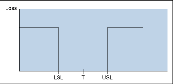
There are two basic philosophical differences between those who support control charts (or Shewhart charts, named for their developer, statistician Walter A. Shewhart) and those who support pre-control charts. The pre-control folks tend to view any product within specification as being of equal good. All outcomes are considered to be “good” or “bad” and the dividing line is a sharp cliff. A part that barely meets specification is as good as a part that is perfectly centered on the target (T) value. Producing product tighter than the specification limits is viewed as an unnecessary expense.
Rath & Strong consultants, including statistician Frank Satterthwaite, developed pre-control charts in the 1950s. This technique focuses on the voice of the customer in that the pre-control limits are based on upper and lower specification limits (USLs and LSLs). These limits are chosen such that the hard stop limit to pre-control charts are at the customer specification and cautionary limits are at ±50 percent of the specification (see Figure 2).
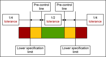
To establish process capability, five consecutive units must fall between the pre-control limits in the green region. After this condition is met, two successive units are periodically sampled. If the two units fall in the green zone, continue production. If one unit falls in the green zone and the other falls in the yellow, continue production. If both units fall in the yellow zone, stop and adjust the process. If one unit falls in the red zone, stop and adjust the process. To resume normal production five units in a row must be within the green zone. The sample frequency is determined by dividing the interval between stoppages by six.
Control Charts
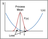
Control chart philosophy more closely follows the Taguchi Loss Function even though control charts were developed in the 1920s and the Taguchi Loss Function was not introduced until the 1960s. The Taguchi Loss Function states that as the parameter (x) varies about the target (T) there will be a loss [L(x)] to society. Thus, a part produced at the target is more valuable than a part produced at the specification limits. This is because throughout the value stream accommodations have to be made to be tolerant to that variation from the target value. That adds cost to subsequent steps in the value stream. (See Figure 3.)
Shewhart chart control limits are chosen so that time is not wasted looking for unnecessary trouble. The practical goal is to take action only when necessary. Control limits are calculated by estimating the standard deviation of the sample data adjusted for sample size and multiplying that number by three. That number is then added to the average for the upper control limit and subtracted from the average for the lower control limit. Shewhart gave us constants to use that ease these calculations. The control chart tests are design to flag points that are not behaving “normally” (i.e., exhibiting special cause variation).
The Shewhart chart focuses on the variation that is due to the process itself. Control limits are developed from the process data and not tied to the specification limits. This is commonly referred to as voice of the process (VOP) as the process is providing information about itself.
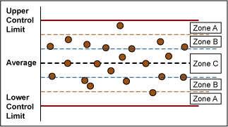
Control Chart Test for Special Cause Variation
There are eight control chart tests that can be done to reveal special cause variation. (Refer to Figure 4 for Zone references.)
- One point beyond Zone A detects a shift in the mean, an increase in the standard deviation or a single aberration in the process.
- Out-patient workload
- Nine points in a row in a single (upper or lower) side of Zone C or beyond detects a shift in the process mean.
- Six points in a row steadily increasing or decreasing detects a trend or drift in the process mean. Small trends will be signaled by this test before Test 1.
- Fourteen points in a row alternating up and down detects systematic effects such as two alternately-used machines, vendors or operators.
- Two out of three points in a row in Zone A or beyond detects a shift in the process average or increase in the standard deviation. Any two out of three points provide a positive test.
- Four out of five points in Zone B or beyond detects a shift in the process mean. Any four out of five points provide a positive test.
- Fifteen points in a row in Zone C, above and below the center line detects stratification of subgroups when the observations in a single subgroup come from various sources with different means.
- Eight points in a row on both sides of the center line with none in Zones C detects stratification of subgroups when the observations in one subgroup come from a single source, but subgroups come from different sources with different means.
Shewhart charts determine what kind of variation the process is exhibiting. Common cause variation is systemic, chronic variation that is produced by any process. It is often thought of as “random” variation and is produced by the process itself. It can be large or small. Special cause variation is caused by a unique disturbance. It is unpredictable and can be large or small. The cause may be known or unknown and is not always bad.
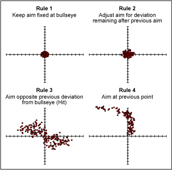
What is the concern in identifying our observed variation as common cause or special cause? Treating common cause variation increases variation as illustrated by Dr. W. Edwards Deming’s funnel experiment described in Out of Crisis. The experiment shows that treating common cause as special cause degrades process performance. Dr. Deming called this tampering.
Figure 5 displays results from a simulation to illustrate the effect of tampering. It shows that treating common cause variation as special cause variation greatly increases variation from the target value; by treating common cause like special cause, the problem worsens. If special cause variation is treated like common cause variation, the root of the problem is not found. Additional variation and cost to the process are likely to be introduced.
Control Charts or Pre-control Charts: An Example
In much of the literature that supports the use of pre-control control, claims are made that control charts are a waste of time and are too cumbersome to use. Often those who hold to control charts claim that pre-control charts will cause users to tamper with their process and actually increase variation. Which group is correct? Consider the following example.
A set of 500 normally distributed data points with a mean of 100 and a standard deviation of 5 was created. Setting specification limits at 100 ±15 results in a Cpk of 1, which is optimum in pre-control terms. The data being normally distributed and centered on the target value is a fair condition for traditional control charts.
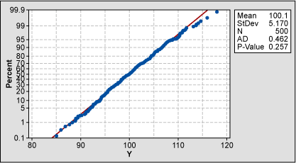
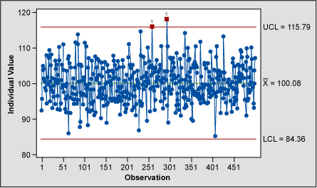
The individuals chart (Figure 7), which is the closest Shewhart chart to the pre-control chart, flags the points as greater than three standard deviations from the process mean. This is expected as the process is centered on the specification mean for this example; 1 in 370 points are expected to fall beyond three standard deviations in a normal distribution. The individuals chart is also the most sensitive of the Shewhart charts but should always be used in conjunction with the moving range chart.
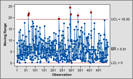
Short term variation is not investigated in an individuals chart. That is the job of the moving range chart (Figure 8). The moving range chart indicates that seven moving range points seem to be behaving abnormally and should be investigated.
The pre-control chart (Figure 9) flags eight additional adjacent pairs as falling two standard deviations away from the specification mean and, thus, require process adjustment. Following the pre-control rules would lead to tampering. A total of 59 points require additional evaluation beyond the Shewhart method in this example.
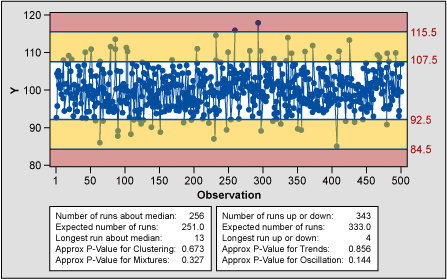
It appears that the pre-control chart would have a higher false positive and encourage tampering. Pre-control measures compliance with customer specification, the voice of the customer. Control charts are measuring process variation or VOP. Control charts offer power in analysis of a process especially when using rational subgrouping. Rational subgrouping also reduces the potential of false positives; it is not possible with pre-control charts.
Pre-control charts have limited use as an improvement tool. Pre-control does not detect shifts, drifts and trends with statistical certainty as control charts or run charts do. See the table below for a side-by-side comparison of the two tools.
| Comparison of Control and Pre-control Charts | ||
| Control Charts | Pre-control Charts | |
| Protects the Customer | In conjunction with process capability | The goal of pre-control charts |
| Useful in Process Improvement | Highly useful | Minimally useful |
| Variation Inflation Risk | Minimal | Likely |
| Ease of Use | 1. Readily available software 2. Chart-based |
1. Must develop manually or write custom software 2. Charting not required |
| Broadly Accepted | Yes | No |
| Conducive to Rational Subgrouping | Yes | No |
| Statistically Valid | Yes | Questioned |
Many quality professionals have declared that pre-control charts have gone the way of the Dodo bird. They are, however, a helpful tool to use after changeovers. Pre-control charts can help to roughly center the process until there are enough points to calculate control limits and reestablish capability – but only if the rules are slightly modified. “If…, stop and adjust the process” should be changed to “If …., stop and investigate the process.” In the event of a pre-control chart trigger, problem-solving analysis tools should be employed rather than blindly adjusting the process.
By using this slightly modified pre-control charting as part of a changeover procedure the customer can be protected until stability, control and capability can be established. There is a great deal of variation as to the number of points required to calculate control limits, from as low as 14 to as high as 100; 30 is the most common. If an institution uses a higher number of points, there might be a place for pre-control charts in its changeover practices.
Resources
- Berardinelli, Carl, “A Guide to Control Charts,” iSixSigma.com, isixsigma.com/tools-templates/control-charts/a-guide-to-control-charts/.
- Bhote, Keki R. and Bhote, Adi K., World Class Quality Using Design of Experiments to Make It Happen, American Management Association, January 4, 2000.
- Deming, W. Edwards, Out of the Crisis, The MIT Press, 1982.
- Martin, Tripp, “Shewhart Charts and Pre-Control: Rivals or Teammates?” Annual Quality Congress,
May 1992, asq.org/qic/display-item/index.html?item=9811. - Wheeler, Donald J. and Chambers, David S., Understanding Statistical Process Control, SPC Press, 1992.