Key Points
- You’ll need to set control limits before constructing your X-bar charts.
- After establishing control limits, you’re ready to build your R-control chart.
- Following your R chart, you’re ready to construct your X-bar chart.
Theoretical Control Limits for X-bar Charts

Although theoretically possible, since we do not know either the population process mean or standard deviation, these formulas cannot be used directly and both must be estimated from the process itself. First, the R chart is constructed. If the R chart validates that the process variation is in statistical control, the X-bar chart is constructed.
Why Are Control Limits Needed?
If you’re looking to build an X-bar chart, you might not have every possible data point available. As such, establishing control limits early in the process is crucial for getting the rest of your data points ready. Going without these control limits is going to make constructing the subsequent R-chart and X-bar chart impossible to do.
Steps in Constructing an R Chart
- Select k successive subgroups where k is at least 20, in which there are n measurements in each subgroup. Typically n is between 1 and 9. 3, 4, or 5 measurements per subgroup is quite common.
- Find the range of each subgroup R(i) where R(i)=biggest value – smallest value for each subgroup i.
- Find the centerline for the R chart, denoted by

- Find the UCL and LCL with the following formulas: UCL= D(4)RBAR and
LCL=D(3)RBAR with D(3) and D(4) can be found in the following table:
Table of D(3) and D(4)
n D(3) D(4) n D(3) D(4)
2 0 3.267 6 0 2.004
3 0 2.574 7 .076 1.924
4 0 2.282 8 .136 1.864
5 0 2.114 9 .184 1.816
- Plot the subgroup data and determine if the process is in statistical control. If not, determine the reason for the assignable cause, eliminate it, and the subgroup(s), and repeat the previous 3 steps. Do NOT eliminate subgroups with points out of range for which assignable causes cannot be found.
- Once the R chart is in a state of statistical control and the centerline
RBAR can be considered a reliable estimate of the range, the process standard deviation can be estimated using:

d(2) can be found in the following table:
n d(2) n d(2)
2 1.128 6 2.534
3 1.693 7 2.704
4 2.059 8 2.847
5 2.326 9 2.970
Steps in Constructing the X-bar Chart
- Find the mean of each subgroup XBAR(1), XBAR(2), XBAR(3)… XBAR(k) and the grand mean of all subgroups using:

- Find the UCL and LCL using the following equations:

A(2) can be found in the following table:
n A(2) n A(2)
2 1.880 6 .483
3 1.023 7 .419
4 .729 8 .373
5 .577 9 .337
- Plot the LCL, UCL, centerline, and subgroup means
- Interpret the data using the following guidelines to determine if the process is in control:
a. one point outside the 3 sigma control limits
b. eight successive points on the same side of the centerline
c. six successive points that increase or decrease
d. two out of three points that are on the same side of the centerline, both at a distance exceeding 2 sigmas from the centerline
e. four out of five points that are on the same side of the centerline, four at a distance exceeding 1 sigma from the centerline
f. using an average run length (ARL) for determining process anomalies
Example
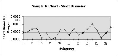
The following data consists of 20 sets of three measurements of the diameter of an engine shaft.
n meas#1 meas#2 meas#3 Range XBAR
1 2.0000 1.9998 2.0002 0.0004 2.0000
2 1.9998 2.0003 2.0002 0.0005 2.0001
3 1.9998 2.0001 2.0005 0.0007 2.0001
4 1.9997 2.0000 2.0004 0.0007 2.0000
5 2.0003 2.0003 2.0002 0.0001 2.0003
6 2.0004 2.0003 2.0000 0.0004 2.0002
7 1.9998 1.9998 1.9998 0.0000 1.9998
8 2.0000 2.0001 2.0001 0.0001 2.0001
9 2.0005 2.0000 1.9999 0.0006 2.0001
10 1.9995 1.9998 2.0001 0.0006 1.9998
11 2.0002 1.9999 2.0001 0.0003 2.0001
12 2.0002 1.9998 2.0005 0.0007 2.0002
13 2.0000 2.0001 1.9998 0.0003 2.0000
14 2.0000 2.0002 2.0004 0.0004 2.0002
15 1.9994 2.0001 1.9996 0.0007 1.9997
16 1.9999 2.0003 1.9993 0.0010 1.9998
17 2.0002 1.9998 2.0004 0.0006 2.0001
18 2.0000 2.0001 2.0001 0.0001 2.0001
19 1.9997 1.9994 1.9998 0.0004 1.9996
20 2.0003 2.0007 1.9999 0.0008 2.0003
RBAR CHART LIMITS:

RBAR  = 0.0005

UCL=D(4)*RBAR = 2.574 * .0005 = 0.001287
LCL=D(3)*RBAR = 0.000 * .0005 = 0.000


XBAR CHART LIMITS:

XDBLBAR  = 2.0000

UCL  =  XDBLBAR + A(2)*RBAR  =  2.000+1.023*.0005 = 2.0005115
LCL  =  XDBLBAR - A(2)*RBAR  =  2.000-1.023*.0005 = 1.9994885
R – Chart:

XBAR – Chart:

Other Useful Tools and Concepts
Looking for other tools to bolster your control charts? Why not consider trend analysis tools? These handy tools allow you to forecast customer needs and expectations based on current and historical data gathered.
Further, you might want to listen to the voice of the process. There are multiple voices found through Lean Six Sigma, but few are as crucial as VOP. Learning how it works, and where to utilize it will allow you to readily address the voice of the customer and the voice of the business.