Category: Graphical Analysis Charts

Thinking Two Moves Ahead with Analytical Tools
Published:Considering the performance of the stock market over the past few years combined with current economic conditions, many financial institutions are analyzing their processes for improvements. Unfortunately, the majority of process improvement tools available to Six Sigma practitioners – such as cause-and-effect diagrams, Pareto charts, histograms and scatter plots – have been used for analyzing […]
Read more »
Experiential Learning of Lean Six Sigma with Marbles and Toy Cars
Published:Conducting experiments using marbles and toy cars is a fun way for practitioners to teach students about the use of graphical and analytical tools, and also give them a better understanding of the Six Sigma mantra to “control x, then Y will take care of itself.”
Read more »
Making Sense of Time Series Forecasting
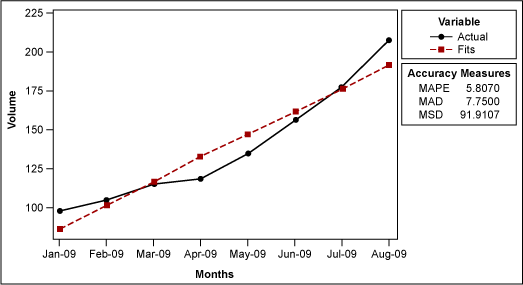
Published:It is a common scenario: A practitioner has sales data for the past several months and wants to forecast next month’s sales volume. This type of forecasting can help manufacturers and distributors ensure they have enough product to meet customer demands. But how is this forecasting done? Statistical analysis software offers two ways to plot […]
Read more »
Bar Chart
Published:Purpose of a Bar Chart A bar chart is used to graphically summarize and display the differences between groups of data. How to Construct a Bar Chart A bar chart can be constructed by segmenting the range of the data into groups (also called segments, bins or classes). For example, if your data ranges from […]
Read more »
Histogram
Published:Purpose of a Histogram A histogram is used to graphically summarize and display the distribution of a process data set. How to Construct a Histogram A histogram can be constructed by segmenting the range of the data into equal sized bins (also called segments, groups or classes). For example, if your data ranges from 1.1 to 1.8, […]
Read more »
Understanding Scatter Diagrams and Correlation Analysis
Published:Six Sigma scatter diagrams and their correlation analyses often debunk management myths. Many times executives assume and/or presume that measures vary together when they do not. Sometimes they assume and/or presume that measures do not vary in concert with one another when they do. For better or worse, budget forecasts are based on these assumptions. […]
Read more »
The Purpose and Practicality of Pareto Charts
Updated:Purpose of a Pareto Chart A pareto chart is used to graphically summarize and display the relative importance of the differences between groups of data. Sample Pareto Chart Depiction How to Construct a Pareto Chart A pareto chart can be constructed by segmenting the range of the data into groups (also called segments, bins or categories). […]
Read more »
Discriminant Analysis Can Minimize Returned Products
Published:Accurate predictions, optimal decisions, and an explanation of root cause and its effects on a process are just a few of the many types of solutions managers are expected to deliver when complex problems appear. Yet, discriminant analysis, one of the most powerful tools used to solve problems in a process, is often neglected in […]
Read more »
Interpreting Anomalies Correctly Can Help Avoid Waste
Published:People say that Six Sigma is sometimes like using a rocket ship engine in an automobile. The techniques and statistical software tools are so powerful they can lead to anomalies in the data or produce “bad” results. These include: Histograms that do not appear normal Scatter plot diagrams that do not fit a straight line […]
Read more »
Using Blended Optimization to Quantify the Qualitative
Published:Because of corporate collapses such as Enron and WorldCom, large financial institutions during the last decade have had to absorb enormous losses. In the wake of these fiscal disasters, financial organizations needed to develop risk-rating scorecards to help them become much more quantitative in how they evaluate and assign risks. Six Sigma can provide a […]
Read more »
Using Quadrant Plots to Improve Program Performance
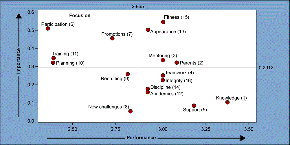
Published:When assessing areas of satisfaction within a company’s improvement program, a quadrant plot comparing importance versus performance of those areas can visually show Six Sigma project leaders where they should focus their efforts.
Read more »