Key Points
- ANOVA is a handy way of seeing differences between data sets.
- You can conduct your own ANOVA with software like Microsoft Excel.
- You can also use Stat-Ease Design-Expert for graphically constructing your own ANOVA.
In 1920, Sir Ronald A. Fisher invented a statistical way to compare data sets. Fisher called his method the analysis of variance, which was later dubbed an ANOVA. This method eventually evolved into Six Sigma data set comparisons.
The F ratio is the probability information produced by an ANOVA. It was named for Fisher. The orthogonal array, the Results Project, and the DMAIC (Define, Measure, Analyze, Improve, Control)-designed experiment’s cube were also his inventions.
An ANOVA can be, and ought to be, used to evaluate differences between data sets. It can be used with any number of data sets, recorded from any process. The data sets need not be equal in size. Data sets suitable for an ANOVA can be as small as three or four numbers, to infinitely large sets of numbers.
Where Does ANOVA Fit Into DMAIC?
When looking at the various phases of DMAIC, you might be curious as to where ANOVAs fit in. They slot in directly into A, or the Analyze phase of DMAIC. When embarking on something like process improvement, an ANOVA can readily pinpoint where errors or defects might arise.
How to Complete an Excel ANOVA
The difficulty of calculating ANOVAs by hand prevented most people from using this Six Sigma tool until the 1990s. Now, using software like Microsoft Excel, anyone and everyone can quickly determine whether differences in a set of counts or measurements were most likely due to chance variation. Or, can we say it should be more likely attributed to a “combination of factors.” These variables are often labeled factor X, Y, or Z.
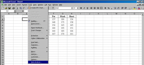
Here is how you could use an Excel ANOVA to determine who is a better bowler. You could and can use an ANOVA to compare any scores. Lengths of stay, days in AR, the number of phone calls, readmission rates, stock prices, and any other measure are all fair game for an ANOVA. Below are six game scores for three bowlers. Which bowler is best? If there is a best bowler, is the difference between bowlers statistically significant?

Step 1. Recreate the columns using Excel. Each bowler’s name is the field title.
Step 2. Go to Tools and select Data Analysis as shown. If Data Analysis does not appear as the last choice on the list on your computer, you must click Add-Ins and click the Analysis ToolPak options.
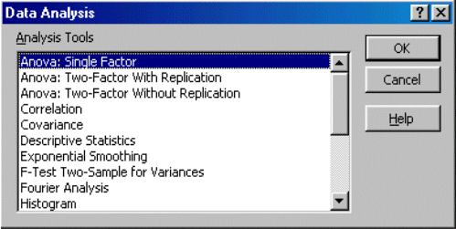
Step 3. Click OK on the first choice, ANOVA: Single Factor.
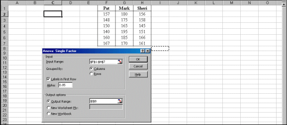
Step 4. Click and drag your mouse from Pat’s name to the last score in Sheri’s column. This automatically completes the Input Range for you:$F$1:$H$7. Click the box labeled “Labels in First Row.” Click Output Range. Then either type in an empty cell location or mouse click an empty cell, $I$8, as illustrated by the dotted cell below. Click OK.
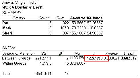
Step 5. Interpret the probability results by evaluating the F ratio. If the F ratio is larger than the F critical value, F crit, there is a statistically significant difference. If it is smaller than the F crit value, the score differences are best explained by chance.
The F ratio of 12.57 is larger than the F crit value of 3.68. Mark is a better bowler. The difference between him and the other two bowlers is statistically significant. Excel automatically calculated the average, the variance – which is the standard deviation, s, squared – and the essential probability information instantly. You can use this technique to compare physicians, nurses, hospital lengths of stay, revenue, expense, supply cost, days in accounts receivable, or any other factor of interest.
The Graphic ANOVA
Excel takes care of the first three Six Sigma rules for completing an analysis. Unfortunately, it does not create a meaningful, analytic graph. As mentioned earlier, most Excel graphs are descriptive, rather than analytic.
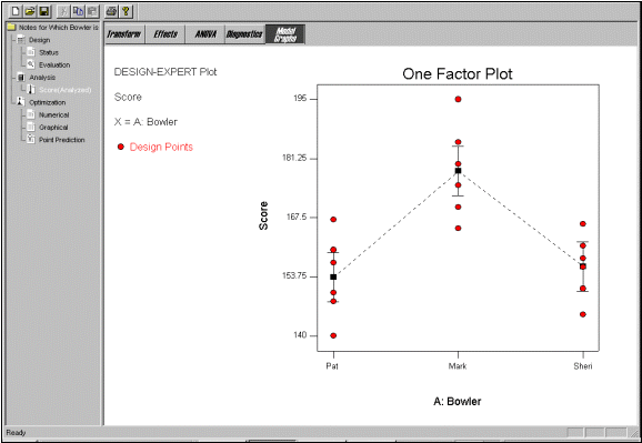
As you advance in your Six Sigma learning you may want to learn to use a more advanced Six Sigma software program. One such program is called Stat-Ease Design-Expert. Stat-Ease calculates an ANOVA and graphically shows statistical differences between sets of data. It is all achieved with mouse clicks. You won’t have to look at or calculate an equation.
 .
.
Each I-Bar has a black square in its center. This square identifies the average score for each bowler. The top and bottom of each I-Bar extends two standard deviations, 2s, above and below the mean. Think of these as the upper control limit (UCL) and lower control limit (LCL) for each bowler’s score. Each I-Bar covers 95 percent of an imaginary, on-its-side bell curve for each bowler.
This Six Sigma data array of fields and records would tell us a little about each observation. The more fields, the richer our understanding can be. For example, in the same amount of space, the following table has twice as much data. Rich data, meaning each column/field has a crystal clear operational definition, can yield rich information. Many times we collect dozens of fields for each recorded observation. Since data collection is time-consuming and expensive, design your collection plan with care before you begin.
Note the overlapping values in red circle markers. On occasion, both Pat and Sheri could have bowled a better game than Mark. But, when the data are viewed using the mean value (![]() ), the standard deviation (
), the standard deviation (![]() ), the probability information provided by the F ratio, and a meaningful analytic graph, Mark is a better bowler. As we mentioned before, he is a better bowler in a statistically significant way.
), the probability information provided by the F ratio, and a meaningful analytic graph, Mark is a better bowler. As we mentioned before, he is a better bowler in a statistically significant way.
Other Useful Tools and Concepts
Ready to supercharge your ANOVA? You’re in the right place. You can take a closer look at what ANOVA is in our comprehensive guide covering the subject.
Additionally, learning the different types of ANOVA like Fisher’s 1-Way ANOVA is a great way of seeing any statistical differences in your data sets.
