In a typical transaction process, non-continuous data is very common. This data does not rely on infinite possible values along a continuum, but simply notes a discrete outcome such as a binary go/no-go or a Likert-type scale. For many organizations, the data comes in the form of survey instruments to measure process performance. Using a quadrant plot in this area can improve program results.
A quadrant plot is a measure of importance versus performance. It uses squared bivariate correlations to determine overall relationships between the two variables. Simply put, a quadrant plot will visually show team leaders where they should focus their efforts when measuring performance.
To develop a quadrant plot, a Black Belt must first determine what is the overall customer satisfaction score and what survey questions correspond to that score.
For this case study, a group of volunteers responded to a program survey of 16 questions on various areas. The areas included things like teamwork, academics, mentoring, participation and training.
Each question could receive a score of 1 (unsatisfactory) to 4 (exceptional). The average score for all 16 questions represented the overall program evaluation. This survey was conducted with 11 random program participants. Statistical software was used to analyze the results.
The first step was to determine the mean for each of the 16 questions on the survey. These was calculated to be:
| Averages for Responses to 16 Survey Questions | ||
|
Question |
Area |
Average |
|
1 |
Knowledge |
3.36 |
|
2 |
Parents |
3.09 |
|
3 |
Mentoring |
3.00 |
|
4 |
Teamwork |
3.00 |
|
5 |
Support |
3.18 |
|
6 |
Participation |
2.36 |
|
7 |
Promotions |
2.73 |
|
8 |
New Challenges |
2.82 |
|
9 |
Recruiting |
2.80 |
|
10 |
Planning |
2.40 |
|
11 |
Training |
2.40 |
|
12 |
Academics |
2.90 |
|
13 |
Appearance |
2.90 |
|
14 |
Discipline |
2.90 |
|
15 |
Fitness |
3.00 |
|
16 |
Integrity |
3.00 |
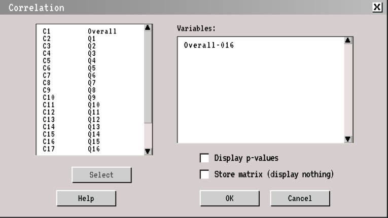
Using the statistical software (in this case study, Minitab), the correlation between the overall program evaluation and the individual question was found. This can be done by using the “basic statistics – correlations” menu in Minitab. The correlation between the variable was chosen by using the overall satisfaction score and the related questions.

The output of the correlation matrix was then transferred to a Minitab column labeled “correlation.” The next step was to determine the squared correlations. For a quadrant plot, negative correlations have an effect on importance. For the customer, negative or positive correlation is irrelevant.
Once the squared correlations are determined by squaring the correlation coefficient, the Black Belt may begin to develop the visual clues to program performance.
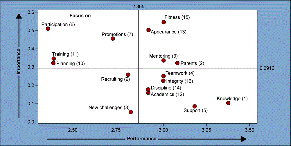
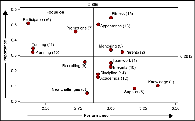
The Black Belt has many options for assessment of a program. This case study presents the use of the mean; however, standard deviation and “top box” also can be used. The averages of both the squared correlation and questions are used to divide the plot for visual clueing. Within Minitab, the Black Belt can use the “graph – scatter plot – simple” menu and enter the averages. The output is the squared correlations and the input is the question performance. Figure 1 is the resulting graph representation for the case study.

From this graph, a Black Belt can see that several areas are important to the participant but the program is underperforming on these areas.
Following the review of the graphical analysis, the management team decided to focus on improvements to participation and training. Participation was expanded to allow the volunteers to instruct classes, additional activities were added to the monthly schedule, and each volunteer was invited to meet with the team leader at least once per quarter. Training gaps had been identified and improvements were made in this area.
One such improvement was to publish the training schedule one month in advance. This not only gave the volunteers the ability to block time out for attendance, it allowed the volunteers the ability to determine if this training was appropriate or if it should be modified to fit their needs better. The volunteers also felt that they were more interactive with the program. Their weekly attendance improved and participation increased.
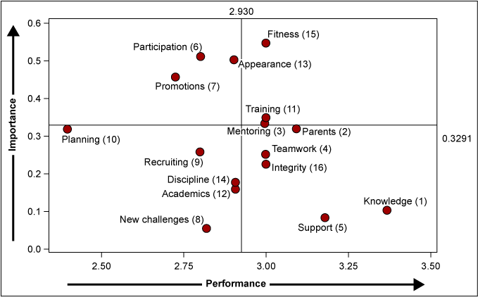
A follow-up survey was administered the next quarter to the 11 original survey participants. A new quadrant plot (Figure 2) shows a dramatic visual difference between the baseline survey and the follow-up analysis.

The use of quadrant plots give Champions and team leaders a visual clue about the performance of a process. This measure may not show statistical significance but it does help identify and determine what areas need improvement relative to the customer rating of performance and importance. For this case study, small improvements to the program yielded increases in two measures. These measures – participation and training – moved from a “poor” customer performance toward a positive performance view.