
When I was trained as a Green and Black Belt, I didn’t fully understand the value of measurement system analysis (MSA). The concept worked, but I thought it was something that you do in one project out of 10 – only when you have the obvious opportunity to prepare a study with the possibility to assess repeatability and reproducibility.
As time went by, I was trained as a Master Black Belt. Working in Anheuser-Busch InBev, I started to sit through Green Belt project coaching sessions. I coached projects myself and then began teaching Green Belts and Black Belts. And during each Measure phase discussion I heard, especially from non-manufacturing project leaders: “Yes, but how does MSA apply to me? I improve market share, I can’t use gage R&R there.”
Having worked with several providers of training content, I still feel that a good general overview of the question is missing. “Hard stuff” such as gage R&R or attribute agreement analysis explanations are easy to find, but there isn’t good guidance on how to do MSA in “softer” cases.
This article attempts to provide high-level overview for the question of choosing the right method for data validity checks.
Select the Right KPI
Any improvement project has to deal with data by definition. Peter Drucker, the founder of modern management, said, “You can’t improve what you don’t measure.” Well, let’s be precise. Without data, you may be able to improve things, but you’ll never prove you have succeeded. This is why in all project management trainings, SMART (specific, measurable, achievable, relevant, time-bound) objectives are discussed.
What also matters is the right level of the key performance indicator (KPI). In manufacturing, every company measures its performance on the factory level and on the individual machine level. However, this is not enough for process improvement.
Manufacturing Example
Consider a manufacturing example. A manufacturing company wants to improve overall equipment efficiency (OEE) of a packaging line. We use the Pareto principle to get to the bottom of things. If there is no granular measurement system in place, it has to be established. But let’s say we have. We break down OEE into categories and see that planned downtime attributes for 30 percent of total capacity loss; we spend too much time on changeovers. The next step would be to identify the number of changeovers and the duration of each and then apply the single minute exchange of dies (SMED) approach for a reduction of changeover time. The right primary metric for this project could be average changeover time. It has to be measured reliably. How can I be sure to trust this figure?
Non-Manufacturing Example
Now let’s take a non-manufacturing example. The logistics department of a fast-moving consumer goods (FMCG) company wants to reduce the number of on time, in full (OTIF) non-compliance due to transport-related issues. A service-level KPI is not granular enough to provide the required visibility. We need to look at categories within the service level. However, aiming at a share of transport-related issues reduction within the total number of issues is wrong because this KPI could improve simply when some other OTIF categories deteriorate. The right KPI here would be the percentage of transport-related issues to the total number of shipments.
So, we selected the right KPI. Then what? Let’s measure the baseline, improve the performance and demonstrate the difference, right? Not quite. We still need to make sure we can trust these figures.
Select the Right Data Validation Method
If you have a project related to KPI improvement, how do you validate the accuracy of the data? In general, you have to consider if you can plan the experiment or not. However, even if you only have historical data, much can be done to evaluate the level of trust in the measurement system.
Figure 1 shows the attempt to provide the algorithm to get to the right validation method.
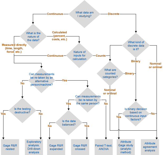
Let’s illustrate this decision tree with a few examples.
1. A beverage company produces bottles with a twist-off caps. Twist-off torque needs to be measured. It is continuous data that is measured directly with a device. However, the measurements for the same bottles cannot be retaken as it is a destructive test. Therefore, the nested gage R&R method needs to be applied.
2. A beer company produced a limited volume of a special brand in the last few years. Due to customer complaints, we suspect there were some issues with the bitterness of the product. The beer is not produced anymore and we don’t have an access to the quality control facility, but we do have historical data. Bitterness could be measured continuously, but we can’t re-take the tests. We have to do exploratory data analysis to make an assumption about whether we can trust the figures.
3. A printing company uses liquid inks during production. In order to provide good quality, inks should have the right viscosity, which is measured by printing operators at the machine. Viscosity is measured indirectly as the number of seconds it takes for ink to run out of a standard measuring funnel. It is continuous data that is measured directly. We can evaluate both repeatability and reproducibility. If we have balanced data (i.e., equal number of measurements per sample between and within operators, and/or measurement devices), we go for a traditional gage R&R crossed study.
If the data is not balanced, or we want to take additional factors into account (for example, interactions between different operators and different measuring devices), we go for an expanded gage R&R.
4. A steel company tries to reduce its total electricity consumption; it is measured by the factory meter. It is calibrated, but to what level can we trust this? It is continuous data that is measured directly, but there is no way to re-test this. The only way to verify is to find an alternative measurement system and then compare the figures using a paired T-test. This alternative could be the meter of electricity provided or the sum of the individual meters installed within the factory (in both cases, power grid losses should also be taken into account).
This method will never tell you exactly how much you can trust the measurement system. What you will get, however, is the confidence interval of difference between two or several values from different measurement systems, so you can decide whether you are comfortable with this difference. Important note: analysis of variance (ANOVA) and T-test assume normality of data. For non-normal data, use respective non-parametric tests.
5. A pharmaceutical packaging line has a control unit that rejects every package with a weight under the tolerance (this can happen if a leaflet is missing). Discrete output (accept/reject) is the function of the continuous input (weight in grams). Therefore, to assess the accuracy of this control unit, an attribute gage study method needs to be applied.
6. During recruitment interviews, assessors evaluate applicants’ cultural fit on a scale from 1 to 5. Based on this and other factors, a different person may decide whether to offer the job to a candidate. In the first case, it is a discrete ordinal measurement (you can only have integer numbers). In the second case, it is discrete binary (yes/no). In both cases, you can apply attribute agreement analysis.
Some Examples of Exploratory Data Analysis
A few simple graphical analysis tools can tell you more than thousands of words. It has been said that there are only three rules about data: “First rule: Plot the data! Second rule: Plot the data! Third rule: Plot the data!” For our purposes, that means to look at the data distribution, check how the process behaves with time and look for some abnormalities – these steps can help you identify if there is anything wrong with the data. Two examples follow.
Example 1: Bitterness of Beer
Minitab’s graphical summary in Figure 2 below shows that this data is not normal. There is a tri-modality of the data (distinctive spikes in three places) that could be caused either by shifts in the process or by other factors.
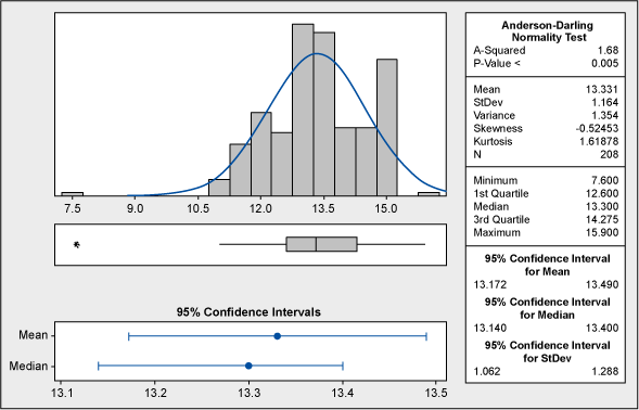
No natural process can be explained like this; therefore, we cannot draw any reliable conclusions before we understand the nature of this abnormality. Could the spikes at 12, 15 and 18 units have any connection with the process specifications? Yes. The lower tolerance is at 12 and the upper tolerance is at 18, which puts the middle value (and target) to 15. This can be seen in the capability analysis shown in Figure 3.
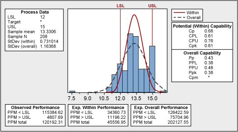
Certain data manipulation took place, where the measured values (especially those exceeding the upper specification) were rounded to the “comfortable” figure. Fortunately, capability analysis shows what the true process looks like.
The practical conclusion here is that the historical data was not reliable. The entire process of taking and recording measurements needed to be improved.
Example 2: Use of Glue
One of the operations in beer packaging production is the application of labels to the bottles. Melted glue is used for this, and its consumption is controlled and reported. For the glue consumption optimization effort, look first at the historical data (Figure 4).
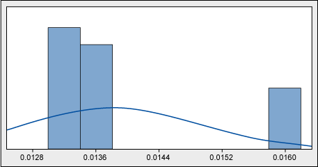
Without even getting a p-value, it is clear that the data is not normal. Why might that be? A look at a time series (Figure 5) might help explain.
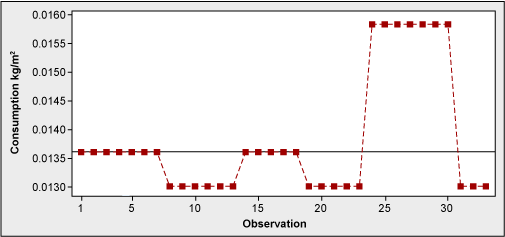
What the histogram showed was a weekly averaging-out – not the picture of daily consumption. Actual measurements were clearly taken once a week, and each figure was smoothed out throughout several days. There was a requirement of daily consumption reporting; however, nobody seemed to be bothered by equal figures from day to day.
As a result of this, daily actual measurements started to take place resulting in much more detailed information available for future process optimization.
Conclusion
No matter what process we optimize, we always need data. Whenever we use data, we must always doubt its accuracy. If statistical analysis can be conducted to estimate measurement error, it should be done. If it can’t be done, seek out indirect ways to understand the level of trust we can have in the given measurement system.