Most Lean Six Sigma practitioners rely on the use of summary statistics (mean or average) to analyze performance and report the results. I have been trapped in this convention for quite a long time, too. However, using this conventional path takes away insights that are useful in our analysis and decision-making. This is one realization I had recently when I used a box plot for a report.
Daily Performance Example
Let’s take an example. Say I pull output data of an HGA assembly line (a semiconductor assembly process) and take the average to represent the daily performance. The calculated average is 29.4 KHGA. Comparing it with the target of 31 KHGA, I conclude that we have a problem of not meeting the requirement. However, plotting the same data set using a box plot might give another perspective.
Let’s set this aside and review some basic concepts about the box plot before we proceed.
What Does a Box Plot Look Like?
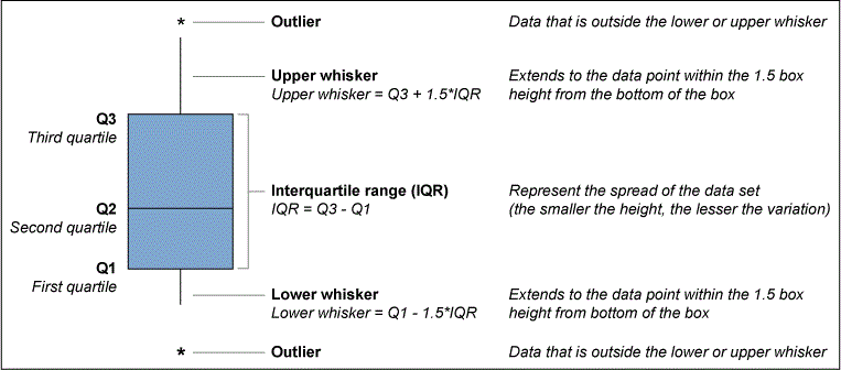
Figure 1 shows the anatomy of a box plot. This graphical technique is based on the principle of quartiles. A quartile divides the whole data set into four equal parts (first to fourth quartile, Q). The second quartile, or Q2, is also the median and serves as the basis of the central tendency for a box plot. Half of the data points fall below the value of Q2 and the other half above that value. The same logic applies for the rest of the quartiles.

The IQR (interquartile range) is the measure of dispersion for a box plot and is also used to determine the endpoints of the upper and lower whiskers. The upper and lower whiskers are calculated by adding 1.5 of the height of the IQR to Q3 and Q1, respectively. Any points that fall outside these whiskers are considered to be outliers.

How Do You Think Outside the Box Plot?
One good thing about the box plot is that it provides a quick snapshot of the distribution of the data and in a glance can provide insights about the data’s central tendency and dispersion.
Fundamentally, a box plot is used for two common reasons:
- To see the distribution of a data set for baselining and/or target setting
- To compare the distribution of data sets across a given category
Let’s apply the first reason and create a box plot to the HGA assembly line output data. Remember, in the example the average line output is 29.5 KHA.
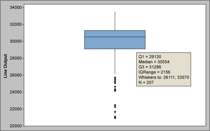
Using the generated box plot in Figure 2, we can gain more insights compared to using a summary statistic (mean). Q1 is at 29.1 KHGA, which means that around three-fourths of the plotted data points are already meeting the required target. Our Q3 is at 31.3 KHGA which means that one-fourth of the data points are already demonstrating the 31 KHGA line target. We can also see several outliers extending up to the ~21 KHGA region. By looking at the mean alone, we will not have a grasp of this information. But with a box plot like this, we get information about the variation within a group.
Now, say we are asked how ready we are with the 31 KHGA requirement. We cannot answer readily with some summary statistic; we need to consult the distribution of the data set. With the box plot result, the insight can be compared to the baseline – that is, one-fourth of the data points already hitting the target; thus, the 31KHGA target is feasible.
Let’s apply reason 2 to the same data set, but this time looking on a daily basis.

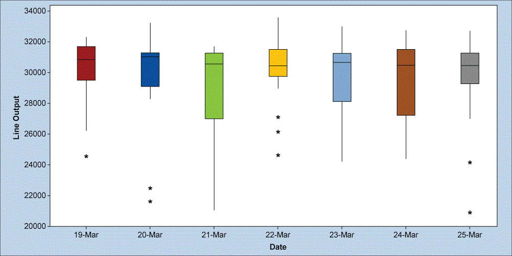
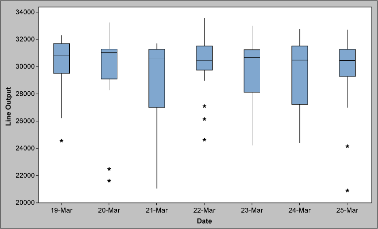
Looking at the box plot in Figure 3, you can see that the line output varies from day to day. Outliers are present daily and could trigger questions like:
- What causes the variation seen on a daily basis?
- Are the outliers from the same line?
- What are the conditions that are present/existing when the line achieved the target output?
By answering these questions, you can understand the variation between groups and take actions to reduce it and optimize performance.
Context Is Everything
Context is everything – especially in statistics or data analysis. Box plots can be useful in understanding data in terms of the central tendency and spread. Its applications will vary depending on your creativity to do so. It will not be the graphical tool for all requirements, but keep it handy in your toolbox and consider when it may be of use.