Considering the performance of the stock market over the past few years combined with current economic conditions, many financial institutions are analyzing their processes for improvements. Unfortunately, the majority of process improvement tools available to Six Sigma practitioners – such as cause-and-effect diagrams, Pareto charts, histograms and scatter plots – have been used for analyzing past performance.
What the financial services industry needs to do, given a still uncertain future, is leverage tools that focus more on analyzing what might happen, taking into account current situations and brainstorming about the future. For this purpose, there are two lesser-known tools that can be beneficial: 1) the relations diagram and 2) the systematic diagram.
At a very high level, the relations diagram is a tool used to systematically identify, analyze and classify the cause-and-effect relationships that exist among critical issues. The systematic diagram is one that displays the means necessary to achieve specific goals and objectives.
The Relations Diagram
The relations diagram was created in the 1950s by Ithiel de Sola Pool, a pioneer in the field of social sciences. He led groundbreaking research in the arena of technology and coined the term “convergence” to describe the effect of various scientific innovations on society. Pool also was interested in the quantitative analysis of communications, and his relations diagrams (sometimes known as content analysis, interrelationship diagrams or conceptual analysis) were first used in the electronics industry to find key words and phrases in text.
The relations diagram (see Figure 1) allows for the examination of problems from a broad perspective, and encourages opinions of process performance to be expressed freely, thereby eliminating preconceptions. Also, it helps organize and explain problems that have a complex factor relationship. With this tool, ideas generated in team brainstorming sessions can be presented and organized in a manner that is more scenario-specific.

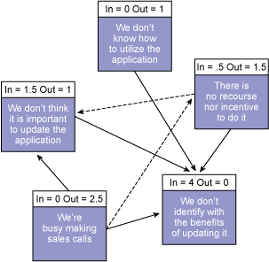
Specifically, the relations diagram captures the issues related to a problem and examines their relationship among each other. In Figure 1, for example, five symbols (shapes) represent issues that are part of the problem (as stated in the problem statement). Those elements are then compared to all others and “influence” arrows are drawn to connect related elements.
Producing the Relations Diagram
1. Identify the problem – An ideal team to construct the relations diagram consists of four to six people. As with most problem-solving techniques, the team must start by crafting a clearly defined problem statement to make it easier to focus thinking during the exercise. This statement should be brief (25 words or less) yet also specific. For example: “Why doesn’t the sales database get updated?”
2. Capture the issues – After the problem statement is created, it is time to identify the current issues at hand. One way to accomplish this is to lay out all the ideas for the issue on a white board or on 3 x 5 cards. If the relations diagram is being created as part of a process improvement project, the issues can also come from the main branches of a fishbone diagram or the main categories of an affinity diagram.
3. Draw the arrows – Next, choose any issue to start building the relations diagram. Utilize arrows to connect the various issues. The arrows should be drawn from the element that influences to the one being influenced. An outgoing arrow shows greater cause than effect while an incoming arrow shows greater effect than cause. Typically, a dotted line is used to mean it has a lesser influence. If a situation exists where two elements influence each other, do not draw two-headed arrows; instead, the arrow should be drawn to reflect the stronger influence. Figure 2 shows a completed relations diagram.

Problem statement: Why doesn’t the sales database get updated?
4. Count the influencers – Finally, count the arrows. The elements with the most outgoing arrows will be root causes or drivers. Conversely, the issues with the greatest number of arrows coming in will be the key outputs or results.
The actual format of the relations diagram is unrestricted, limited only to the team’s creativity. Even though diagrams may differ, if they are focused on the same problem, the conclusions are typically the same. However, if the connections between the factors are too simplistic, the arrows may point in misleading directions. On the other hand, when portraying factors in too complicated a fashion, the diagram becomes difficult to understand.
Relations Diagram Matrix
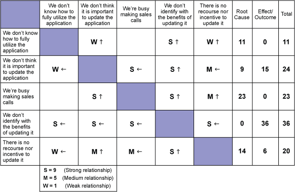
Often, the problems a team is trying to solve come with many associated issues. While spaghetti diagrams are helpful in conveying the seeming chaos of this situation, they can be difficult to navigate. Alternatively, a relations diagram should be relatively easy to interpret. When a multiple-issue situation presents itself, a matrix version of the relations diagram may be appropriate as illustrated in Figure 3.

The Systematic Diagram
Although the systematic diagram was created in the 1970s, it was no doubt inspired by the learnings of Kurt Lewin, who is perhaps best known for developing force field analysis in the 1930s and the application of force field diagrams – a technique often deployed in the Lean Six Sigma toolkit. Lewin utilized a systematic diagram-like tool to solve an issue fundamental to social and personality psychology, namely the relative contributions of personality and social environment to human behavior. The systematic diagram was originally designed to aid reliability analysis of nuclear power plants in Scandinavian countries by identifying the potential modes of component failure. The diagram related the causes to consequences for the system.
The systematic diagram displays the means necessary to achieve specific goals and objectives. It can be used to find the most suitable means of realizing an objective amid multiple paths; something many practitioners often face. This is much like the “5 why’s” technique that is often used to drill down to a root cause during problem solving.
The systematic diagram also facilitates the transition from theory to action and helps identify the true complexity of achieving a goal. It is instrumental in the development of objectives and solutions and helps clarify departmental and control functions. Once cause-and-effect or fishbone diagrams have been used to brainstorm on all possible causes, a systematic diagram can help bring order and clarity to the goals and means.
Producing the Systematic Diagram
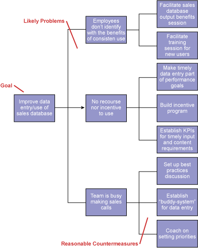
1. Select the CTQ Goal – The key to creating the systematic diagram (Figure 4) is to start with the “end in mind” by selecting a customer CTQ goal. This can come from taking the step with the greatest outputs (root causes) in a relations diagram and placing it at the head of the systematic diagram. Or a team can transform the original problem statement into more of a stated goal/CTQ. If, however, the team is developing the systematic diagram as a stand-alone tool, the first step is to create the problem statement, which should contain the primary critical-to-quality (CTQ) metric.

2. Populate the levels – Figure 4 details the three levels of the systematic diagram, with Level 1 being the primary goal or CTQ. The second level represents the likely problems the team encounters. In addition, this second level could be utilized for goal achievement. The third level represents the countermeasure or actions the team can take to mitigate the problems. In other words, what activities are needed to correct the prior level? Team members should be certain to capture assignable tasks, due dates, responsible resources and so on.
After the team has captured the goal and CTQ – and is brainstorming through the various levels of the diagram – team members should be sure to ask questions and challenge the items on the table. For example, “How do we make that happen? Why do we need this? Is there something obvious that was forgotten? Do I really need to do all these tasks to meet the objective?”
To rank the listed countermeasures in order of importance, practitioners may choose to have the team employ a multi-voting process. With this tool, each member ranks each item with a number that corresponds to its importance. Those with the highest rankings receive the most attention.
Like chess players, practitioners who use relations and systematic diagram tools not only can analyze past moves, but also look forward two or three moves, planning for the future. This positions them to better achieve their goals.