To fully understand your data, there are four characteristics you should use to describe it. They are the center, spread, shape and outliers. While you can do that with statistical calculations (mean, standard deviation, normal distribution), you can also do it with a graphic of your data.
The stem and leaf plot uses your data to form an easy to visualize graphic. Let’s see how to make one.
Overview: What is a stem and leaf plot?
The stem and leaf plot takes your numerical data and breaks it into a base number called the stem, and subsequent values called the leaf, or leaves. The look of the stem and leaf plot is similar to what you would see in a histogram except, in the leaf and stem plot, you use the actual numbers rather than a bar to represent the data.
There are four simple steps to constructing a stem and leaf plot.
Assuming we have the following data, here is how to construct the stem and leaf plot: 15, 23, 12, 32, 47 and 54.
- Sort your data in ascending order (12,15, 23, 32, 47, 54) and determine your lowest and highest numbers. In our case, it would be 12 and 54.
- Determine the stems. These would be the first unique digits of the data, or 1, 2, 3, 4 and 5.
- Draw a vertical line and list the stems on the left.
- Fill in the leaves on the right and order them.
Here is the result:
1 | 2, 5 (12, 15)
2 | 3 (23)
3 | 2 (32)
4 | 7 (47)
5 | 4 (54)
An industry example of a stem and leaf plot
The Six Sigma Black Belt (BB) of a company wanted to show the manufacturing manager the current monthly data for the filling line. Previously, data was presented in rows and columns of numbers. Shown this way, it is not easy to discern the story the data was conveying.
The BB decided to display the data in the form of a stem and leaf plot, and then provide an interpretation of what the data was telling him.
Below is the actual data:

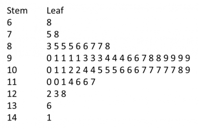
Following the steps described above, the BB created the following stem and leaf plot:

The BB interpreted the graphic for the manufacturing manager this way:
- The distribution of the fill process appears to be normally distributed, or at least symmetrical and bell-shaped.
- Most of the data is in the 90s and 100s.
- The smallest value is 68, while the largest is 141.
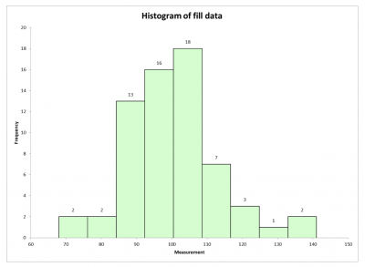
The BB also did a histogram for comparative purposes.

The stem and leaf plot essentially provides the same information as a histogram, with the following added benefits:
- The plot can be constructed quickly using pencil and paper.
- The values of each individual data point can be recovered from the plot.
- The data is arranged compactly since the stem is not repeated in multiple data points.
- The stem and leaf plot offers information similar to that conveyed by a histogram, and easily can be constructed without a computer.
Frequently Asked Questions (FAQ) about a stem and leaf plot
1. What is a stem and leaf plot used for?
It is used to display quantitative data in a simple graphical format. The stem is usually the first digit in the data, and the leaves are the subsequent digits.
2. What is the difference between a histogram and a stem and leaf plot?
The stem and leaf plot uses the actual data values in the graphic, while the histogram represents the data as vertical bars.
3. Can I use a stem and leaf plot with negative numbers?
Yes, just follow the same process, with the negative numbers being the first ones when ordering the data.