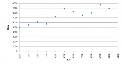
If you have ever watched a news briefing about an individual stock’s performance in the market, you have likely seen a scatter plot on your television screen. Let’s show you how they work.
Overview: What is a scatter plot?
A scatter plot is also known as a scatter graph or scatter chart. With one, dots are representational of values for two variables. The dots not only show the values of data points on the graph, but when viewed en masse, can reveal patterns.

3 Benefits of Scatter Plots
There are several key benefits to using scatter plots:
1. They are fast
If you want to show a clear correlational relationship between two variables, a scatter plot is a quick and easy visualization to create by inputting data points into a program. A positive or negative correlation between variables in the visual representation is easy to understand by nearly anyone.
2. Identifying anomalies
Scatter plots are also useful for identifying any outliers or anomalies in the variables that are showing up as part of a dataset
3. Comparison
Scatter plots are also useful for quickly comparing several datasets that utilize the same variables.
Why are scatter plots important to understand?
Scatter plots are absolutely essential to understand if you are in the business world. Here are a few reasons why:
Spotting relationships
You will often wonder if one thing has an effect on the other in your business. Scatter plots help you spot the correlation quickly. If the two variables have no effect on one another, the data points will just look like random dots around the graph.
Forecasting
Since you can see the correlation between two variables with scatter plots, you can be better prepared for future outcomes.
Persuasion
A scatter plot is such a simple and elegant visualization. If there is a clear correlation between variables, it is almost inarguable when a scatter plot is shown. This is a great tool to have on your belt for demonstrating the benefits or drawbacks of changing a process, swaying investors or shareholders, and more.
An Industry Example of Scatter Plots
The CEO of a garment company wants to gradually raise prices on all of the company’s items over the next two years. It is decided to run some scatter plots to see what an ideal price point would be. The company experiments with pricing over the two years, finding ways to increase the price as high as it can before they begin to negatively affect the revenue the sales they make are generating. They come up with the perfect price for maximizing sales, in part, by making a deep dive into analyzing the scatter plots.
3 Best Practices When Thinking about Scatter Plots
There are some practices that will help you when it comes to scatter plots:
1. Avoid overplotting
If you have an excessive number of data points to input, you can run the risk of overplotting. This can make it difficult to see the correlation between variables because they will be so tightly packed. One strategy for alleviating this is to focus on a subset of data points, which should allow you to spot the correlation between the variables if there is one. Another option is to change the form of the dots or their size so that there is less chance of overlap.
2. Be careful of invalid interpretation
There is a common phrase in statistics that simply states, “correlation does not imply causation.” Just because a relationship is spotted between a couple of variables does not mean that the changes of one are directly responsible for the changes in the other. There could be a third, unseen variable that is driving the relationship. There is even the possibility that the perceived relationship is a matter of coincidence.
3. Spotting the correlation
When the variables are correlated, you will find that the data points exist along a curve or a line. The points will hug closer together along the line, the tighter the correlation.
Frequently Asked Questions (FAQ) about Scatter Plots
Does a scatter plot always have two variables?
Yes. There is an independent variable that is graphed on the x-axis and a dependent variable that is graphed on the y-axis.
What types of scatter plots are there?
There are various types of scatter plots or charts. These are positive correlation, negative correlation, no correlation, U-shaped, linear, and exponential. The three main ones are positive, negative, and no correlation.
What is a good alternative to a scatter plot?
A heatmap could be a good alternative to a scatter plot when there are too many data points that are causing overlap.
Whether you are trying to improve processes or trying to make a solid argument about where your marketing focus should be, scatter points are a powerful way to demonstrate relationships between variables. They are a simple and effective way to visualize where you are in your business, where you have been, and where you are headed.